Zero to Sixty in One Second
Fusing WebGL, CSS 3D and HTML
Ladies and gentlemen, this is your captain speaking. Today's flight on WebGL Air will take us high above the cloud. Those of you sitting in Chrome class, on the desktop side of the plane, will have the clearest view. Internet Explorer class passengers may turn to their in-seat entertainment system instead. Passengers are reminded to put away their iPads and iPhones during take off and landing.
Edit: You can now also watch the YouTube video kindly provided by Leland Batey.
Acko.net, the domain, just turned 13, so it's time for a birthday present in the form of a complete front-end rewrite. The last design was entirely based on CSS 3D: it was a fun experiment, but created at a time when browser implementations were still wonky. It ultimately proved impractical: the DOM is not a good place to store complicated geometry. It's too bulky and there is a huge difference between a styled <div> and a shaded quad. After adding WebGL to the mix with MathBox and typesetting with MathJax, it turned into a catastrophic worst case for loading, and the smoothness was often lost even on fast computers.
Since then, we've seen a big push for rendering performance, both from the native and JS side. Hardware-accelerated DOM compositing is better understood, requestAnimationFrame is now common-place and reliable, and we have excellent profiling tools down to the frame level.
Hence the goal: to fuse 3D elements into the page like before, but with full 60 fps rendering. Plus to use WebGL instead of CSS 3D where possible, and be free of the constraints of the DOM.
Like Voodoo.js I use a fixed full-screen canvas and sync up scrolling with a 3D camera. The scene is mapped to CSS pixels and CSS perspective is locked to the camera. Once HTML, CSS 3D and WebGL are all in sync there's a truckload of linear algebra and easing functions to keep you amused. The code is based on the platform I kludged together for the christmas demo, at times a mess of ad hoc demo formulas and spaghetti, though robust enough in the parts that count.
Procedural Wildstyle
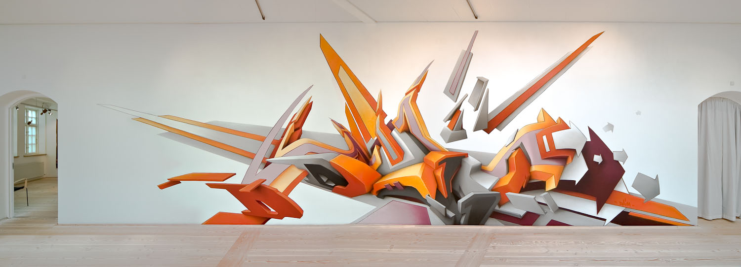
The so Designers Republic kitsch of last time was starting to grate, and I wanted something more stylish. Taking inspiration from street art and graffiti, in particular long-time favorite Daim, Acko's gone wild, though with a math twist. This design was built procedurally using some nifty vector calculus and more difference equations than you can shake a stick at.
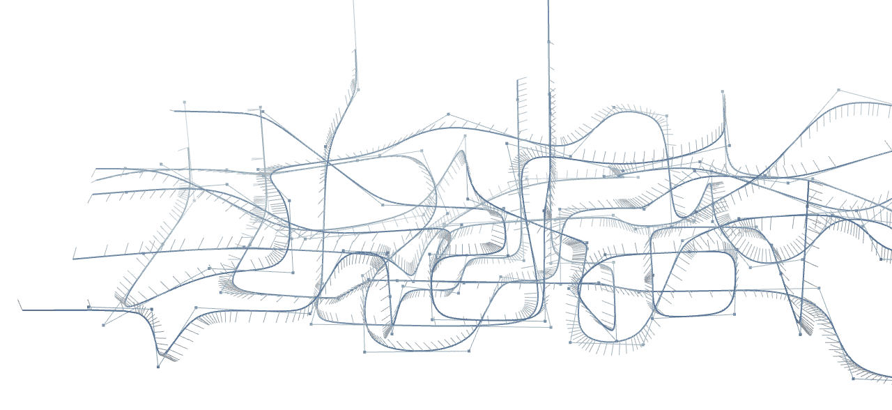
At its heart it's really a game of Snake, albeit a complicated one. Starting from a line-based skeleton of the model, the curves are traced out, smoothed, oriented and finally extruded on the fly into ribbons. The final pose shows 261 lines mapped to 2,783 curve segments, tessellated into 43,168 triangles, though that amount is just a knob that can be tuned. In other words, it's a scalable vector graphic. No images were harmed in the making of this header, or the rest of the window dressing for that matter. These pixels are local, organic and bespoke, though I'm pretty sure they're not vegan.

The ribbons need to animate, so I'm using a slightly exotic set up: a single Three.js BufferGeometry mesh is created with all the ribbons' topology in it. It only contains the connectivity of the triangles that span the vertices, stored as indices. The actual positions and normals are read from a texture that is updated on the fly by JavaScript using gl.texSubImage2D.
As a ribbon follows its path, only its head and tail change, growing new segments or collapsing older ones. Each ribbon scrolls through the texture, which alters only a fraction of the total data per frame. Both the head and tail can add and remove segments at will, which allows me to vary the geometrical detail along each path. As long as the number of drawn segments at any given time never exceeds the texture height, a ribbon could in theory follow an infinitely long trail, wrapping around the edge endlessly. They're basically semi-virtualized meshes, allocated out of a fixed memory space. The arrows are an easy upgrade: I allocate a couple additional segments at the end and shape them to the right widths.
To draw a ribbon, I draw one contiguous subset of the total mesh (or two, if wrapping around the edge) which maps into a rectangular area of the texture. Ribbon color is stored statically as a vertex attribute, which means the entire hero piece can be drawn using a single shader, texture and vertex buffer.
For the background, I added a static BufferGeometry clocking in at 3,344 triangles. It consists of rounded boxes laid out in a randomized hyperboloid pattern. Aside from breaking the uniform whiteness, it's also quite the parallax enhancer down here.
DJ Ambient
All of this is shaded with some custom GLSL. I use a basic Blinn-Phong lighting model tweaked for aesthetics, and there's some edge highlights and fog to top it off. But if I left it there, the result would still look pretty flat, without shadows. A common approach is to use shadow mapping, but that only works for point sources like the sun. The diffuse shadows that you see on an overcast day require an entirely different approach.
What's needed is ambient occlusion, a measure of how much skylight is obscured by the surrounding geometry at every point. The less sky you can see from a point, the darker it should be. This is slow to compute analytically for large scenes and hence is typically either faked or baked in. An easy hack is Screen-Space AO, which is really just crease darkening using the final image's depth buffer. It's clever but expensive, creating only local shadows. Quality can vary a lot between implementations, often creating distracting dark or light halos around silhouettes. They all share the same blind spot: only the currently visible pixels can cast any shadow. So while I added alteredq's SSAO shader, it's disabled by default and only rendered at quarter resolution, upscaled with a bilateral filter to hide this fact.
Instead, I used a technique from NVidia's GPU Gems 2. It uses a disc-based model to calculate occlusion and even indirect lighting on the fly. Rather than go real-time on the GPU, I decided to only do it statically in JS, and just do plain occlusion without light bounces.
The discs for all the ribbons are generated ahead of time, and the disc-to-disc shadowing is done once for the final model in two passes. The first pass overestimates due to overlapping shadows and thus is too dark. The second pass uses the first to assign lesser weights to discs in shadow to compensate, then runs the algorithm anew.
There's another simplification: instead of small one-sided discs based on the real geometry, I use large two-sided discs and treat each ribbon as flat. Each disc occludes in both directions, but accumulates shadow on its front and back separately. This gives a decent approximation of light around and across the entire object.
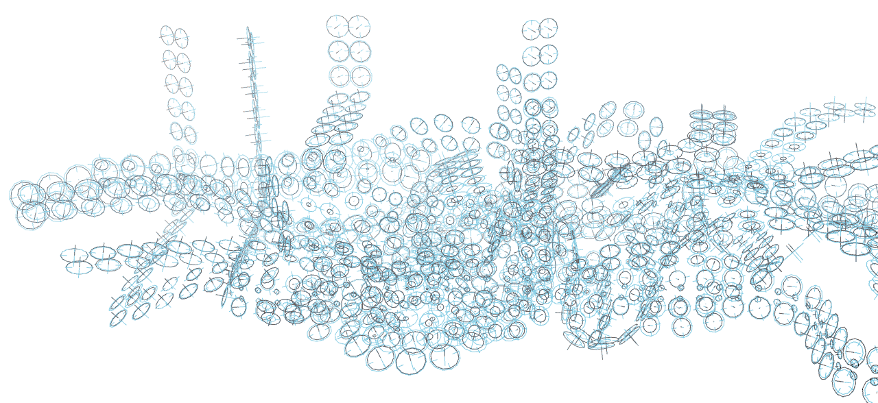
Below is the actual disc model. In this diagram, the two radii of each disc represent its front and back illumination, with smaller discs receiving more shadow. The crosshairs mark the real disc radius.

When streaming out new pieces of ribbon, the occlusion is baked in on the fly, stored in the unused alpha channel next to the position (RGB). The four nearest discs on the ribbon are interpolated bilinearly, and the vertex's normal and position is used to mix the front and back shadow values appropriately. Thus it's effectively trilinear filtering a 2×2×N voxel grid per ribbon, which snakes and twists along its length.
I'm very happy with how good it looks, even with very coarse divisions like this. Unlike SSAO it costs practically nothing once generated. If you wish, you can view the design entirely in white to examine the lighting—or in black and white, or in the seventies, tone mapping is fun.
To ensure smooth rendering, the resolution is scaled down if it drops below 45 fps for several frames. This is essential on slower GPUs, but can sometimes overcompensate, as WebGL is easily interrupted by other tasks on the machine. The browser doesn't tell you how much you're currently pushing it, so it's impossible to safely scale back up without causing more stutters. To mitigate this problem, I built in some strategic reset points, like when you focus the window or scroll to the top. In the end, 60fps happens more often than not, though it remains a goal rather than a guarantee. If you fullscreen your browser, you are now the bane of my existence, especially if you keep two dozen other windows open on the second monitor at the same time. On an underpowered retina MacBook.
Finally I also turned on MultiSample Anti-Aliasing to avoid the dreaded jaggies and make the vector style shine. It's substituted with Fast Approximate AA if it's unavailable. FXAA is also used if SSAO is enabled, as you can't post-process multisampled images with WebGL.
Preparing all of this would take ~400ms on my 4 year old laptop, but most of that is spent on the occlusion which is static. Hence, I saved the lighting data into a JSON file for speedier loading, which cuts it down to ~100ms. The data gzips into 18KB, about the size of a small PNG, so no worries there. Add to that the time required to fetch and run the rest of the page, and we can call it an even second.
Of course, it only works on a subset of browsers and leaves the vast majority of mobile devices out in the cold. It does work in Chrome Beta on Android, though performance and stability is still pretty crap and more fixes are needed, both in the browser and in my own code. Rather than try and emulate some of the bling for CSS 3D-only environments, it's all or nothing. Without WebGL, you get plain images.
Achievement Unlocked
Reading all that, you might mistake the header as a mere love letter to hackery. But there's a twist, quite a literal one. The twisting of each ribbon is not generated arbitrarily, but mathematically derived. It embodies the differential principle of parallel transport. The up direction changes parallel to each curve, which means the ribbons never rotate in place. They only turn when they naturally want to. Hence, the design kind of has a will of its own. I can set the initial up direction of a ribbon, but only affect it through its curved path. Arranging and tuning all the ribbons was a nice puzzle in itself, and it's a nice nod to the math that's all over the place, even if it is invisible.
As I started playing around with some screensaver-style shots, I realized it would make a pretty neat demo just by itself, so I built that in too, to the dulcet tones of Selah Sue—whose last name I hope is not indicative. Here parallel transport would ensure a perfectly smooth ride, but that's not exciting, so there's some springy exponential easing with adaptive lookahead instead. That's on top of the secondary demo, which features an audio visualizer and the smooth drum and bass of Seba. There's maybe a third one too.
The songs are used here entirely for educational purposes of course. Not that it matters, since they're all on YouTube anyway. Click the Growl-like notifications to find out more about the artists. There's also a handful of achievements to be gathered, eight to be precise. Some of these are experiments that were turned off in the final version. Others are... trickier. Oh hey, did you notice the JS console?
By the way, special mention also goes to Time and how some browsers keep terrible track of it. Like when you're trying to sync a demo to a stuttery <audio> clock, Firefox ಠ_ಠ. There's also the matter of what to do when the user switches to another tab, and the answer is.... it'll desync, because I don't want to be sapping resources in a background tab. Minor constraints of putting on a live act, doors close after the show starts.


Turn Right Past The Header
The refresh-less navigation is also back from last time, slightly cleaned up. It still works on the same basic principle of fetching static, full HTML documents. However the transition mechanism now carefully choreographs the necessary DOM manipulation to avoid stutters: any image, iframe or video inserted in the content would mean future paints at an unknown time, so they're postponed until after the transition is complete. I did it the dirty but fast way, with string manipulation before it hits the DOM: such is the luxury of being the only one, person or machine, writing the markup.
Which leaves of course the content. But don't fix what ain't broke: distraction-free publishing is easy enough with Jekyll and a responsive 960 pixel grid with sideburns, so things still look and work mostly the same. I only added a home for my math talks and expanded the front page to highlight some demos and experiments. I aim to keep focusing on quality rather than quantity, and to remind visitors what the web looks like when you take away everything social media's done to it.
It's also fun to observe that after many years, the unified front-end convergence really has arrived. There is little difference between this site and the games that use HTML for their UI, such as the latest Sim City. For dealing with typography, illustration and UI, you want the comfort of DOM and CSS. For real-time graphical content, you'll want to draw it yourself, either in 2D, or 3D. Combine the two, and you get what game developers have been doing for years. Only this lacks all the sharp C bits, which game devs been replacing with Lua for years anyhow. That's Portuguese for "JavaScript" by the way.
So there you have it. A fresh look with a pile of juicy hax, and hopefully not too many bugs in the wild. Thanks go to all those who came before and provided all these toys for me to play with. You can too, for the source is entirely on Github. Like I said, educational. Meanwhile I'll be over here, listening to the wipE'out" soundtrack on repeat in memory of the old one. Comments welcome on Google Plus.
PS: The previous version has been archived with its fallbacks disabled so you can see the current state of CSS 3D in browsers. Still pretty broken. Still a great test case. So is the disembodied head.
