LeuvenSpeelt another year
Update: check out the poster I did for the event as well.
Just like last year, my (now) ex-university, the Catholic University of Leuven, still has a theaterfestival for and by students. Friends of mine organise it and I'm the resident web monkey and designer for their site and poster. The site's domain name means "Leuven plays" and is a pun on theater and plays (it works in english too). So, every year we try to base ourself on some playful theme when coming up with the promotional material.
In the past, there's been blackjack and chess. Last year's design came out really well, so I posed myself the challenge of doing even better.
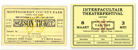
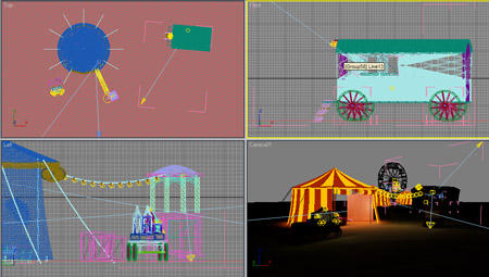
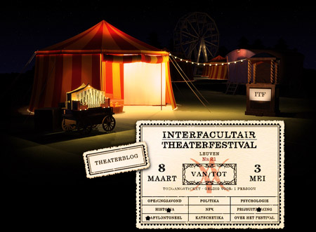
I redesigned the site from scratch, this time using a 1930's carnival/fair as the theme. A lot of Google Image researching by the organisers found lots of tents, wagons, clowns, snake ladies, acrobats and bearded women. I modelled the carnival setting in 3D Studio Max entirely from scratch, using free textures found on the web as well as custom painted textures. We also found some very nice ticket designs, which lead to the typography and framing of the page.


The renders were cut up into layers and composed into a semi-fluid CSS-based layout (no flash). Then I turned that into a Drupal theme and installed it on the site. The result is very heavy on images (with several hundred of KB's of PNGs/JPEGs), but in this case it's acceptable as the site's audience will consist 99% of students browsing through the university network or someplace close.
To make the ticket metaphor even better, I used some JavaScript and cookie magic to issue each visitor a unique ticket with a printed serial number. Each page you visit punches a hole in the paper, though of course you can still browse the site as much as you want. If you wait an hour or more and come back to the site, you'll get a fresh ticket with a new number. The serial number is in fact just a hit counter in disguise.
Just like the previous years, there are two easter eggs hidden around the site. You'll know when you've found them.
The only hiccup was getting IE6 and IE7 to play nice. In the end, there are only a few minor issues that don't damage the design overall, except for one IE7 issue left to solve. All other browsers played nice from the start.
The site can be found at LeuvenSpeelt.be (Dutch).
Next up is finishing the work on this year's poster, which uses the same overall setting.
