Poster for Interfacultair Theaterfestival done
I just finished designing the poster for this year's theaterfestival at my ex-university. I already blogged about the websites for the event which I made.
The poster follows the same carnival theme as the website and reuses several elements from the 3D scene. It's rendered in a flatter composition and looks more like a mini-tent or puppet show.
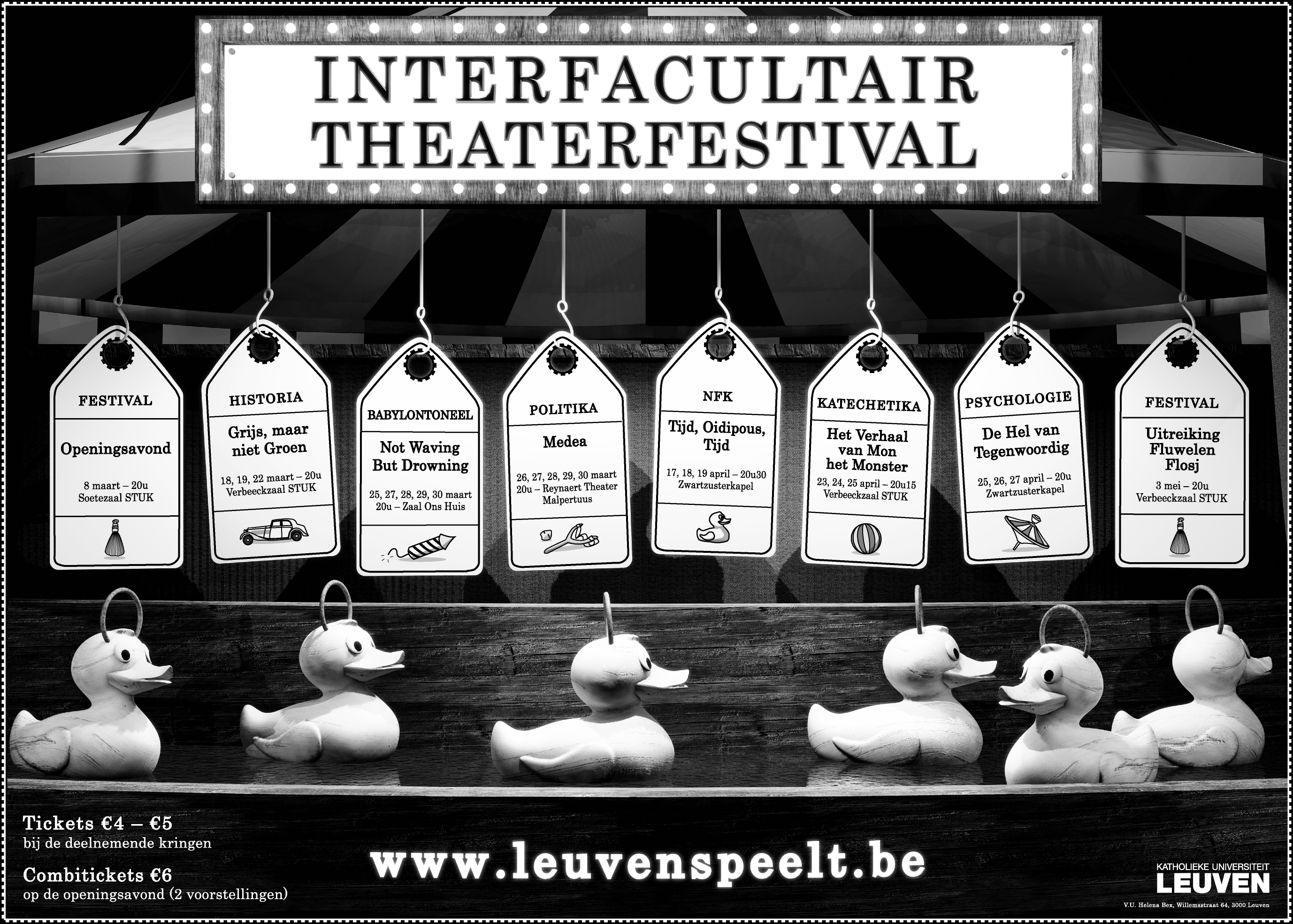
The challenge every year is finding an aesthetic way of cramming the information for up to 8 events on a single poster. The festival's branding is important (which explains the large title and website address), but these posters are going to be used for over 2 months. So, I chose to focus the design around the dangling labels for the events, with the floating ducks as decoration. In Belgium at least, there is a game at fairs where kids have to fish out rubber ducks from a steady stream using a small fishing rod, so it's a recognizable setting.
The 3D render was exported to a PNG and decorated in Illustrator. All the text and print on the design is vector art, so it will print crisply. For the 3D rendering, it is unpractical to go beyond 250 dpi as it takes too much time and memory to produce the image. Still, 250 dpi is sufficient for posters like this, as the final print will be 70 x 50 cm large (7000x5000 pixels @ 254 dpi).
I made an effort to paint and collect high quality textures for all the objects, so there is plenty of detail to look at up close. Every element looks realistic. Check out this high resolution version (3.5 MB) to see. The final PDF however is 2.5x more detailed, even.
More info about the event can found in this blog entry, or on the event's website (if you read Dutch).