Noir meets web
After 4 years of LeuvenSpeelt.be aka the Interfacultair Theaterfestival at my old university, the organisers are calling it quits. I was their resident web monkey, and designed a new site and poster every year. I always saw these designs as an opportunity to explore unconventional web design, as the sites were low on content and high on marketing — essentially being fancy brochures with a news feed.
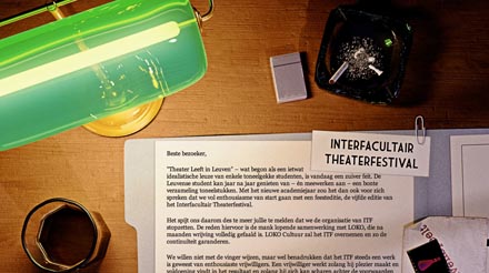
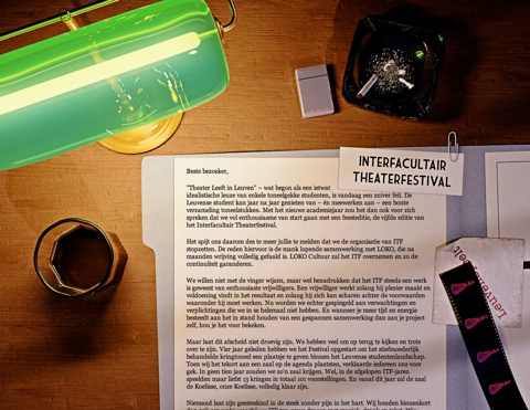
With a track record of originality, I figured we should end it in style, so I whipped up a new page which explains the reasons for quitting (i.e. the politics) and highlights the work done with a timeline and some photos.
I wanted the reader to get a sense of ambiguity and dread that comes with ending big projects, so for inspiration I looked to Film Noir, known for its mystery and shady morals. The scene is meant to look like the desk of the typical private detective, who is trying to make sense of a case.
The end result was pretty close to how I imagined it, though the limitations of the web as a medium required me to tone down the contrast quite a bit for readability. This makes it lose some of the noir-ness, but overall the cohesion of the piece is still right. Because it's just a good-bye page, it probably won't get as much exposure as the previous editions, but it's the thought that counts.
I think it's a fitting end to a project that, more than anything else, has taught me about graphical design and style.
Tools used: 3D Studio Max (with Mental Ray), Photoshop, TextMate
