Introducing Facing.me A unique way to meet people through video chat, wrapped in a sophisticated CSS3 UI.
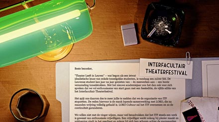
Noir meets web I designed a 'farewell' page for Leuven Speelt, a student theater group run by friends.