Update: and now, IE8 adds even more odd behavior to the mix!
A while ago, John Resig pointed out some issues with sub-pixel positioning in CSS. The problem he used is one of percentage-sized columns inside a container, where the resulting column widths don't round evenly to whole pixels or don't sum to the correct total. His conclusion is that browsers each have their own way of dealing with the problem.
I've recently been bumping into a related issue however, that shows the situation is even worse: rounding is inconsistent even inside a single browser.

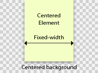
Take the following scenario: a fixed width element that is horizontally centered in a viewport using margin-left: auto; margin-right: auto;. The viewport has a horizontally centered background image, having background-position: 50% 0. This is an extremely common page structure.
You'd logically expect the background image and the element to line up, and move as one when the viewport is resized. However, this is not the case. Depending on the viewport width, the background can be offset one pixel to the left or right. This obviously wreaks havoc on many designs. I decided to investigate this more closely and the results are not pretty.
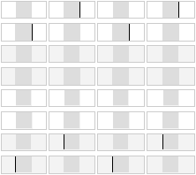
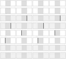
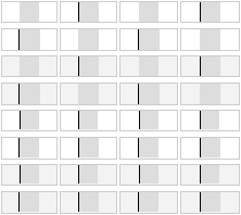
My test case consists of the basic structure described above, repeated in a bunch of mini-viewports. Each background image contains a black box of a certain size, and is overlaid with a grey element that covers this box exactly. If the two pieces align, there should be no black peeking through on the sides, and each box should be fully gray.
For full coverage, I vary the following parameters:
- The width of the viewport
- The odd/even size of the box/element
- Background image is bigger/smaller than the viewport
- Background image is padded evenly/unevenly around the box (1px difference). (*)
I tested this in IE6, IE7, Safari 3.1.2, Firefox 3.0.4 and Opera 9.6.2.
The result is quite baffling: not a single browser out there rounds background image positions the same as element positions, resulting in misalignments. The tell-tale black lines show up in every browser:
IE6 and IE7:

Safari 3.1 and Opera 9.6:

Firefox 3.0:

What's worse is there isn't a single case (across viewport sizes) that is handled consistently between all the browsers. So this CSS technique should in fact be considered broken.
Of course this brings up the question: is it really a browser bug or just an implementation quirk? I would argue that at least in the case where the image's width parity matches the element's, you'd expect perfectly matching rounding (i.e. for the first four rows of test cases). The other test cases are more ambiguous, and all you could hope for is consistent behaviour in each browser individually.
I wonder why this hasn't been brought up more though. A quick sampling of designers around me shows that they have all encountered this bug, but don't really know a fix and just tweak the design or layout structure to mask the effect.
If you really do need to align a background image properly, there is an ugly work-around: place your background image on an additional fixed-width element layered behind the center column. Center the background's element using margins rather than the background image itself, and clip it off at the sides using overflow: hidden on an additional wrapper. This causes the background's position to be rounded the same way as the column on top.
(*) Note that there is a choice whether to pad more on the left or on the right. I chose the left. This means that the last 4 rows of test cases are inherently ambiguous: a browser that misaligns all of these in the same fashion is in fact being consistent, just in the opposite direction.

There IS a sort-of work around to this..
I found it a while back when I was running into the same thing.
I found a solution somewhere ( can't for the life of me remember) and it works out to be something like this:
body {
background: url('whatever') top center repeat-y;
/* Set up your repeating background shim. For this I'm assuming it's a border that wraps around an 800 pixel wide container*/
padding:0px!important; /*this padding hack fixes things */
padding:0px 0px 0px 1px;
text-align:center;
}
#container {
width: 800px;
margin: 0px auto;
text-align: left;
}
This will align a container in the center of the page (800 px wide), as well as adjust the background to always be in the correct center.
The issue itself is called the "Jogging Background bug" and from what I have found, this generally fixes it. I haven't used it in a while, but my old example still works, and it's in Firefox 3 so...
In any case it's a silly bug that shouldn't even exist. I mean really, how hard can it be for everyone to round to the same point?
@Corey: Are you sure?
Your fix should only affect IE6, due to the use of the !important trick, and even then, it only adds a one pixel offset (thus simply inverting the shift/no-shift bit). I just tried it myself and I still get the same pattern of pixel jogs that my test case revealed.
I tried both Standards and Quirks mode too. Same deal.
I found the following page that mentions your fix, and in fact it shimmers in Firefox 3 for me (look at the red header):
http://www.pmob.co.uk/temp/onepxjog.htm
In Safari 3, it doesn't shimmer except when the viewport is smaller than the image size.
This is all on OS X. Are you getting different results on the test cases?
This is really curious. Good
This is really curious. Good post
Hmm,
Interesting case, Steven. Hm, I'll have to think on if I have done anything to fix this in the past. I've noticed this before, but just passed it off as being a quirk, and not really attempted to fix.
This worked for me
Great topic, it has bugged me for a long time. I started thinking about it and thought if it is a rounding problem, then maybe the browsers would have trouble rounding odd width background images and fix itself. Well, for Firefox it worked, and IE 7 it worked too. I guess it has to do with the fact you cannot split a pixel.
Anyway, I hope it works for everybody else.
@Joe: covered in the test case
The test cases I used cover all combinations of odd/even width, and show no consistent behaviour for any of them. What numbers did you plug-in exactly for the different variables (i.e. column width, image width, viewport width)? Did you use browser specific tweaks? Also, did you test Safari/Opera?
I looked at your site and its structure differs from this problem: your vertically repeating background image is set on a fixed-width element, not on the viewport, and consequently your page cannot shrink beyond the width of the background.
The point of this blog post is that when the background container's width needs to be variable, rounding behaviour becomes inconsistent and impossible to harmonize.
I know...
Sorry, I didn't give you the home page of the site I actually am using it on as it is still on our testing server. It is a repeat-y graphic in the body. Background image width is 961px (meant to be 960px). The page overlaying it is 920px in width as the background image is the shadow and columns of the page. It definitely works for me, but I have not tested it on Opera or Safari. I had a similar problem with my previous site, which is now http://www.2005.spicy.com.au. I am not sure now if it is the "oddness" about the image, or just the fact that if it occurs it is fixed by adding a pixel.
All I know it is working here for me and I am stoked that I can continue to finish the design. I did notice you did the testing with different widths, so I am clueless as much as you seem to be.
Decimals?
Just as a thought, has anyone tried using eg: 49.99% for the left positioning? Maybe that way it always keeps it to the left. I will test and keep you informed when I get a spare moment.
Padding or Margin!?
Joe inspired me to try tweaking the number being used to center the "wrapper". Instead of 49.99% I simply put a pixel of padding on EITHER the left or right side of the wrapper, and it worked (a) for my site (and b) in IE7.
I'd be curious to know if this works for other designs/browsers -- I wanted to post this idea before I completely forgot rather than wait until I can validate it.
Curiously, it doesn't matter whether I use a pixel of padding or margin or which side I add it to -- worked in all instances. If somebody would like to explain that to me...
...works to a point
Hmmm. Today I look at the same code and I see the pixel offset when I use margin or padding on the right (or none at all). It's pretty obvious so I don't understand why I didn't see it yesterday.
Adding a pixel to left margin or padding seems to work until the browser window becomes narrower than the background image. Then it appears to offset 50% of the time, implying that the rounding hack stops working when the background image's LEFT position would be a negative number.
Intersting
Really intereting, thanks for this tip.
Just wanted to say thanks
Just wanted to say thanks for documenting this; have spent a total of six hours rehashing my site thinking it was just my maths not adding up! Added 1px to the right of my wrapper and happy days are here again
same issue
My site is having the same issue with the red vertical bar displayed in the site. Looks great in FF obviously, but 1 shim off in IE7. I had adjusted the math before to even numbers, and that had fixed it. Still showed up off in IE6 though.
http://www.d-3entertainment.com
This was a rush site, so I didn't get too involved with a CSS structure. There's obviously some involved, but will I have to go full on if I want everything to line up properly... at least in FF and IE?
Fixed my alignment issues.
I fixed my alignment issues in Firefox with this JS snipet;
<script type="text/javascript">
window.onload = resizeIfOdd;
window.onresize = forceBrowserEven;
function resizeIfOdd(){
if(navigator.userAgent.indexOf('Firefox/3') != -1 ||
navigator.userAgent.indexOf('WebKit') != -1)
if(document.documentElement.clientWidth % 2 == 1)
window.resizeBy(-1,0);
};
function forceBrowserEven(){
window.setTimeout('resizeIfOdd()',5);
};
</script>
Also, the the IE hack that I think might have been mentioned is this;
body { margin-left: 1px }Obviously you'll need separate stylesheets for the IE hack to work.
One word of caution though, my site in which I've fixed the issue is www.gamerzunite.com and I recently tried to use Adbrite to buy some advertising for it but one of their rules says that you can't use JS code to re adjust the browser! So my ad was denied. :(
Regards,
David
www.davidahaynes.com
RE: Fixed my alignment issues.
I'm not having any issues in FF, just IE. I've tried this hack, but it didn't change anything.
body { margin-left: 1px }IE8
Has anyone tested this issue in the up and coming IE8 browser? Two things that really piss me off about css is the lack of consistent height 100% support and accurate centered rounding.
IE is the Devil...
I'm in the same boat with you guys. IE isn't working for me, but Firefox is fine with a 1px padding-right style added to my repeating background. I tried using conditional code for IE with no luck:
< !--[if IE]>
#mainbg {
margin-left: 1px;
}
< ![endif]-- >
I need your help, fellow gurus of the web.
I've never found a fix for this
I researched this a bit about a year ago, and found absolutely no fix. I also found a lot of people saying they have a fix, and every person that said they had a fix, when I looked into it, their fix didn't work, or it was not the exact same issue.
Good luck! :)
Easy fix?
Of course there is the obvious solution. Make the background image accompany either flavor of rounding. For instance - your background image has a right side and left side and in between would be where your page falls. Just take the right side of the image and shift it left 1 pixel, or a few pixels just to be safe.
There will probably never be a solution to the actual problem, it'd be like asking the browser developers to all switch to a singular rendering engine. We can always dream though, right?
Safari 4
Congratulations to us all - it looks like Safari 4 only exacerbates the issue. I've been trying for two days to get it to play while also fixing Firefox 3.0.8 and IE. No luck.
Oh, thank the CSS Gods
Almost ready to hurl my computer at the screen ... until I added one pixel to my outer wrapper and VIOLA. Right as rain, no jagged misalignment. Thanks, guys!
Thanks
I've encountered the same issue, and no solution found !
I just fall on your blog and I want to thank all those who participate in finding the solution
A quick comment
Hi i know this is an old post but seems fairly active still. I am in no way a css expert but i have brought the problem down to the fact that you cant centralize an image either with an odd amount of pixels or a browser window size with an odd amount of pixels.
What i mean is say you had an 800px width image. you can center it up on a 1000px browser window size without a drama. But if you resize your browser by 1px to lets say 1001px your content may move while your background image stays put as you obviously cant halve pixels.
I tried grabbing the right side of my Firefox browsers width and slowly scaling it outwards pixel by pixel and watch the problem appear then disappear each time.
Has anyone really cracked the problem yet?
FIXED in Safari 4, Chromium, IE6, IE7
Here's a fix for a problem that only appeared in the above browsers (across OSX10.5 and WinXP). It did not appear in FF3 and IE8.
My code had two DIVs taking up the full width of the window, one inside the other, each with a centred BG. The 1 pixel jog showed up on window resize.
I tried a number of fixes (and there are a lot of them out there) but the one that worked for me was this:
HTML
<div class="main-content-bg-rpt"><div class="main-content-bg-static">
</div>
</div>
CSS Fix applied via some browser detection voodoo
div.main-content-bg-static{margin-left: 1px
}
That's right - 1 pixel margin left on the inner DIV.
Feel free to experiment on your own scenarios - try a negative margin, try the outer DIV, try both at once. Now I have centred backgrounds across FF3, Safari 4, Chrome(ium), IE6-7-8 (sorry Opera!).
big thanks
Ric, you are God.
That fix actually worked for me. I wish I had this link in the morning :)
keep divs together to maintain alignment
The only way to really keep the divs from misaligning is to tie all the divs together so that they all move together.
For example, if you have a background image set in the body and then divs which need to align to that image, you'll get a 1 pixel shift depending on the browser window width.
My solution was to create a wrapper for the background image and then contain my page elements tightly with no margins inside a 'content' div. Everything moves together. I then place any divs that require margins further inside.
It takes a little planning but you can often eliminate the 1 px shift by laying out your divs differently. The code is a bit messier but it does work.
You can't always do this but it often works. I still run into trouble where I have two background images that I need to align.
I did try the javascript above and it seems to work though I noticed that there's some latency. The divs align after a second.
I was having this same
I was having this same issue, I just changed my values to even numbers, and problem solved. If you can find a way to just shift your design a little, making the values even that you intend to center seems to fix the problem for me.
IE8 fix
I had this issue as well, but I had the main div aligned (right and left) to auto so it would center the div. In an internal div I had a corner in background mode that had the 1px difference in IE. Since I couldn't do the: margin-right: 1px; I did: padding-right: 1px;
#top {
width: 950px;
height: 360px;
margin-right: auto;
margin-left: auto;
display: block;
padding-right: 1px; /* I did this instead */
}
#top #top-der {
margin-top: 51px;
float: right;
height: 309px;
width: 721px;
background-color: #E2DED5;
background-image: url(../images/box-corner.jpg);
background-repeat: no-repeat;
background-position: right top;
}
It works fine now in IE6, IE7 and IE8.
elements moving 1px when scrollbar is present
Hi, Just found this site because I was looking for a fix to a strange 1px problem.
I noticeed I got this problem on Safari & Chrome lately.
a header was the only element that shifted 1px to the left when all other centered elements were staying put.
the solution was to add padding-left:1px to the offending wrapping element, worked for me in both scrollable pages and non scrollable pages, and still kept my background image as an even number, same as the element it was in.
I hope others may find this useful... it is a workaround that has worked for me so I thought I would share.
Hi all, nice to see the
Hi all, nice to see the problem discussed somewhere on the web! :) It's solved in FF 3.5.x!!
Making the background-containing div with fixed width and auto margins on the side fixes the problem. The background shadow is not that wide anyway so a width of 1000px will do fine on 1024 screens too.
A Good Fix for some situations
Hi
I found this solution on another blog and it works well in some situations. Basically if you have the background image starting at 0 0 instead of centered then this will not shift at all. Then you put a margin 0 auto on the containing div at the size you need and the problem went away for me. Here was the original post I found:
terje (the original poster)
A very anoying bug indeed, however there is a permanent solution that works with any window size, you have to use a container element though.
If you have a centered background with a width of 960px you write something like this:
div#container { width:960px; margin:0 auto; background:url(/images/bg.gif) repeat-y 0 0; }Proper alignment of a body image
I tried everything that is suggested here. I also though up some of these semi-solutions myself, but no luck.
It's not even that big of a problem aligning a background making it centered in all browser windows. My biggest problem is a background-image that I want to repeat vertically. And because height: 100%; is a big nono, I can't use any of these solution presented here.
Has anybody tried the following?
<div id="left"></div><div id="right"></div>
<div id="yoursite"></div>
div#left{
float: left;
width: 50%;
z-index: 1;
position: relative;
background: url(left side of bg image);
}
div#right{
background: url(rightside of bg image);
float: left;
width: 50%;
z-index: 2;
position: relative;
}
div#yoursite{
width: 990px;
z-index: 3;
margin: 0px auto;
position: relative;
}
The only time this does not work, is when people have really outdated display, with resolutions as small as 800x600. But If you have a resolution as low as 1024 your safe.
So is there a way we can influence the WebKit developers?
Since we cant find the answer for this one using normal techniques, why don't we appeal to the idiots that created the damn thing in the beginning.
Someone send them an email or petition or whatever!
woooooooo..
so great! Thank you !
Post new comment