<?xml version="1.0" encoding="utf-8"?>
<feed xmlns="http://www.w3.org/2005/Atom">

  <title><![CDATA[Acko.net]]></title>
  <link href="https://acko.net/atom.xml" rel="self"/>
  <link href="https://acko.net/"/>
  <updated>2026-03-05T12:10:39+01:00</updated>
  <id>https://acko.net</id>
  <author>
    <name><![CDATA[Steven Wittens]]></name>
    
  </author>

  
  <entry>
    <title type="html"><![CDATA[Why Android Hates You]]></title>
    <link href="https://acko.net/blog/why-android-hates-you/"/>
    <updated>2013-05-22T00:00:00+02:00</updated>
    <id>https://acko.net/blog/why-android-hates-you</id>
    <content type="html"><![CDATA[<style type="text/css" media="screen">
@font-face {
  font-family: "Roboto";
  src: url("/files/android/Roboto-Regular.ttf"), local('Roboto');
}
@font-face {
  font-family: "Roboto";
  src: url("/files/android/Roboto-Bold.ttf"), local('Roboto');
  font-weight: bold;
}
.roboto {
  font-size: 85%;
}
.roboto p {
  color: #444;
  background: #eee !important;
  padding: 28px !important;
  border-radius: 7px;
}
.roboto, .roboto strong {
  font-family: Roboto, sans-serif;
  text-transform: none;
}
.roboto strong {
  font-weight: bold;
  font-size: 120%;
}
</style>

<div class="g8 i2 first"><div class="pad">

<h2 class="sub">Usability, Affordance and Grannies in Vegas</h2>

</div></div>

<aside class="g4">
  <p class="tc">
    <img style="top: 0" src="https://acko.net/files/android/nexus4.jpg" alt="Nexus 4" class="flat" />
  </p>
</aside>

<div class="g8"><div class="pad">

  <p>For quite a while, I've been an Android user. After upgrading to a Nexus 4 several months ago, I'm living the Ice Cream Sandwich and Jelly Bean dream, enjoying a beautifully designed user experience, <a href="http://en.wikipedia.org/wiki/Matias_Duarte">just like Matias intended</a>, right?</p>

  <p>Nope.</p>

  <p>Android has a problem and no, this is not about fragmentation. I'd like to talk about Android's contempt for its users instead. See, no matter how many pages of tastefully designed <a href="http://developer.android.com/guide/practices/ui_guidelines/index.html">User Interface Guidelines</a> the team puts together, Google just can't seem to shake its deep seated belief: that users are the most inconvenient and unreliable part of the cloud, and that getting adequate mediocrity across the board is the best you can do, rather than taking a holistic approach and excelling.</p>

  <p>Strong words, for sure. Ever tried to get support from Google? If you've studied <a href="http://www.amazon.com/gp/product/0465067107/ref=as_li_qf_sp_asin_tl?ie=UTF8&amp;camp=1789&amp;creative=9325&amp;creativeASIN=0465067107&amp;linkCode=as2&amp;tag=ackonet-20">how objects are supposed to be designed</a>, owning an Android phone is an exercise in frustration. It's a daily reminder of bad decisions, performed with a stubborn flourish, by someone who maybe doesn't have the skill or desire, but more likely, just isn't given room to do better.</p>

  <p>None of what follows are mortal sins, let's be clear on that. But they're missed opportunities in making Android actually pleasant, and they're a last-mile of frustration some of which Steve Jobs would've probably fired people over.</p>

</div></div>

<div class="g7"><div class="pad">

  <h2>Don't Get Comfortable</h2>

  <p>
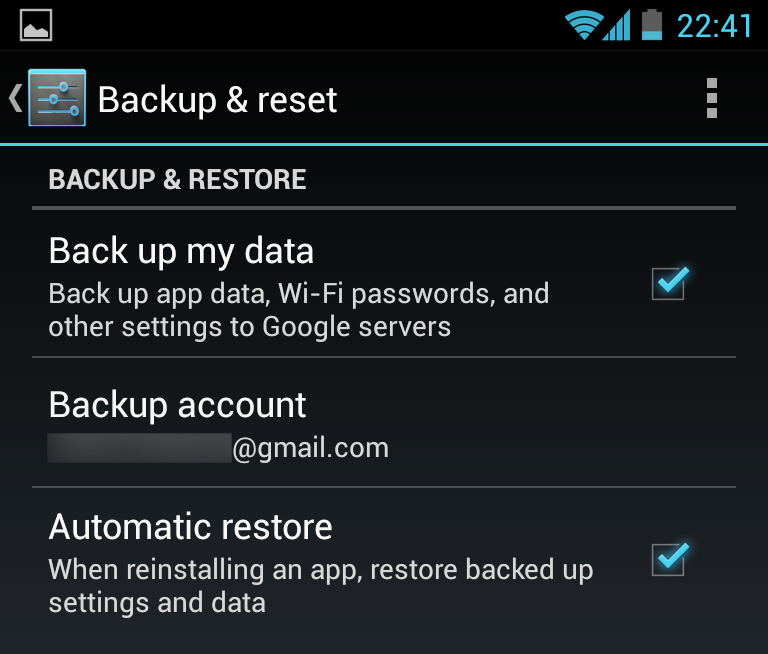
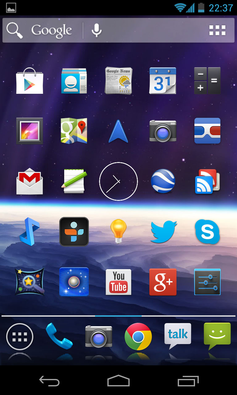
Since the dawn of time, my Android phones have claimed that app data and settings will be backed up to the cloud, courtesy of Google. By "data and settings" they mean "except the stuff you actually care about".</p>

  <p>It comes as absolutely no surprise that none of them have ever restored the layout and arrangement of icons and widgets on the home screens from the cloud. The only thing that seems to happen is that a bunch of apps get downloaded one after the other, spazzing out your notification bar for up to an hour if the connection is slow, filling up your app drawer while you're trying to put things back. Actually showing a progress of the entire restoration, perhaps estimating when you can expect it to be back to the way it was, is a pipe dream. Backing up to the cloud is done manually through apps, like G+ photo upload, or other third party mechanisms.</p>

  <p>After restoring your phone, you can also look forward to repeating all the patronizing tutorials and "Don't stick your fingers in the sockets" warnings of Google Now, Maps, Navigation, Goggles, etc. and certainly not removing "U.S." and "Sports" from your default news subscriptions, because that's what everybody likes.</p>

  <p>
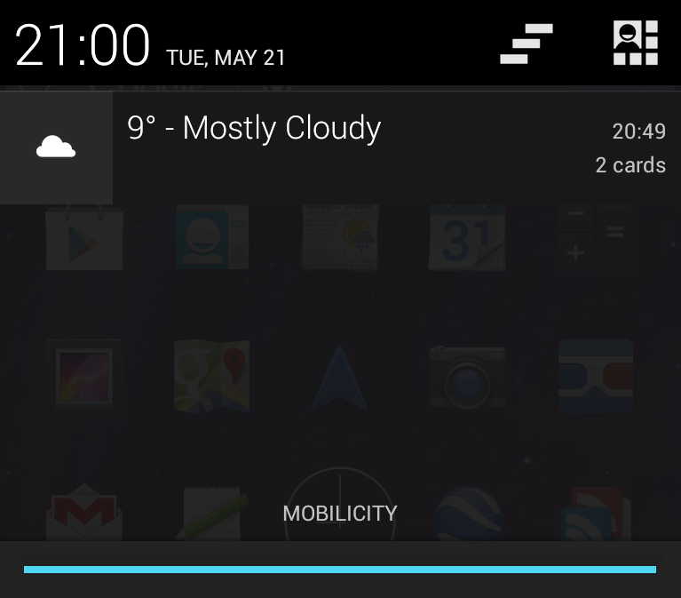
The fact that nobody at Google seems to consider this a problem is quite telling. But then, so is the default layout you get out of the box, or in this case, after "restoring my settings". Only the wallpaper was saved:</p>

</div></div>

<div class="g5 m1"><div class="pad">
  
  <p><img src="https://acko.net/files/android/backup.png" alt="Backup settings" /></p>

  <p><img src="https://acko.net/files/android/app-down.png" alt="Downloading Twitter" /></p>

  <div class="roboto">
    <p><strong>Never lose my stuff</strong><br />“Save what people took time to create and let them access it from anywhere. Remember settings, personal touches, and creations across phones, tablets, and computers. It makes upgrading the easiest thing in the world.”</p>
  </div>

</div></div>

<div class="c"></div>

<div class="wide mt2">
  <img src="https://acko.net/files/android/outofbox.jpg" alt="Android of of the box" />
</div>

<div class="c"></div>

<div class="g6 m2"><div class="pad">

  <p>
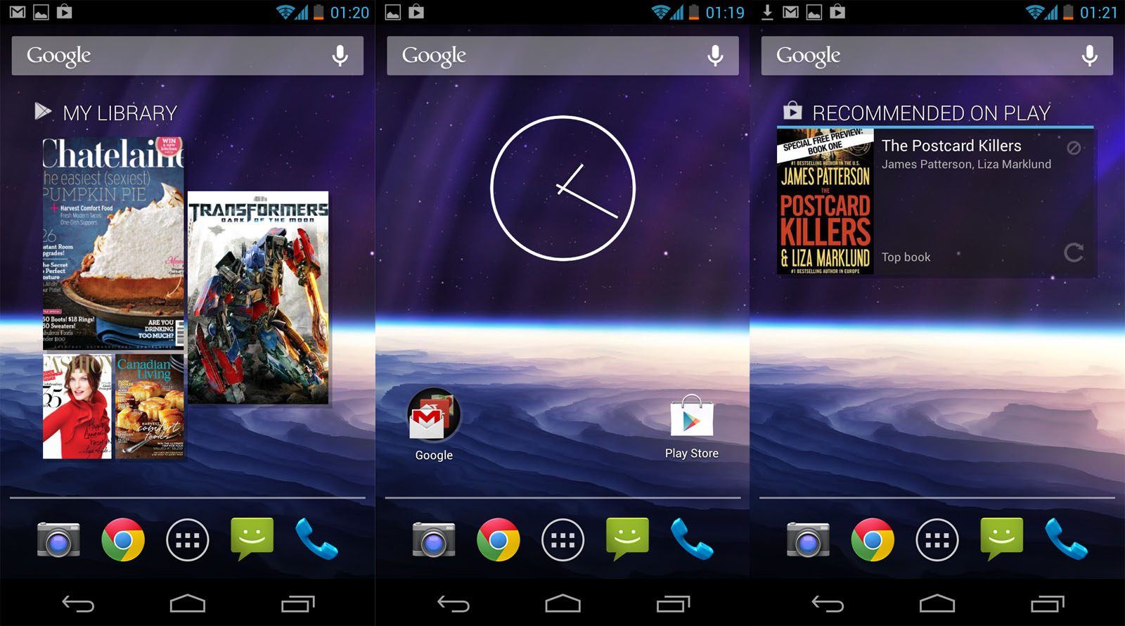
All the Google things are lumped into one folder, which includes the amazing labels "Play Music" alongside "Play Movie…", "Play Maga…", "Play Books" and "Play Store". The hesistant newbie has to make the cognitive leap that "Play" is not a verb here—despite the tacky golden rapper headphones—rather than conclude that Google has weird taste in words, or that this is a phone for children.</p>

  <p>The action verb they were looking for instead was "Buy Music" and "Buy Movies". It seems they replaced the media player with a shop you can keep your own tunes in. My advice: get rid of the advertisements posing as widgets and use <a href="http://www.doubletwist.com">DoubleTwist</a> instead.</p>

  <p>
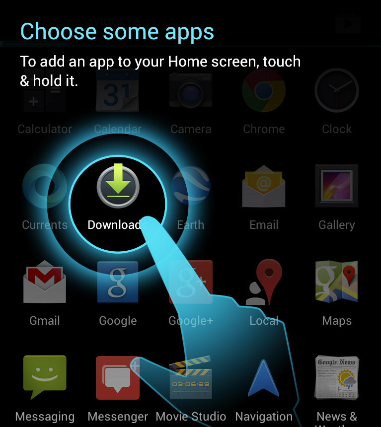
Actually presenting functionality is a job left for the App Drawer, paralyzing you with choice by Pokémon. There's two Mails, three Googles, three Messengers, a whole Play-set as well as assorted circles, pins and triangles. You'll find yourself dragging every app you'll use regularly somewhere more convenient. Open App Drawer. Pan. Draaag. Repeat.</p>

</div></div>

<div class="g6 m2"><div class="pad">
  <p><img src="https://acko.net/files/android/google-folder.png" alt="Google folder" /></p>
</div></div>

<div class="c"></div>

<div class="g6 m1"><div class="pad">
  <p><img src="https://acko.net/files/android/app-drawer.png" alt="App Drawer" /></p>
</div></div>

<div class="g6 m1"><div class="pad">

  <p>As an aside, out of the box, don't expect that people can just send you geo coordinates, video messages, meeting invites or office documents. Whenever it's really mattered that I read something on my phone right now, Android's given me more "I don't know what to do with this" errors than even my Windows 98 box back in the day. Clearly this is just a matter of hooking up the right pre-existing bits, and the newer releases are better. But still, it feels like a lot of real world use cases weren't tested, in particular without an internet connection.</p>

  <p>Just recently, I couldn't turn off the Satellite layer in Maps because I didn't have data, even though I'd cached the whole city I was in. Bug or fluke? Who knows. And when Google Now showed me flight info for the wrong day, there didn't seem to be a way to correct it. The algorithm knows better than you do, human.</p>

</div></div>

<div class="c"></div>

<div class="g12 m1"><div class="pad">
  
  <div class="roboto">
    <p><strong>Decide for me but let me have the final say</strong><br />“Take your best guess and act rather than asking first. Too many choices and decisions make people unhappy. Just in case you get it wrong, allow for 'undo'.”</p>
  </div>

</div></div>

<div class="c"></div>

<div class="g8 i2"><div class="pad">

  <h2>Don't Touch Me</h2>

  <p>As late as the Nexus One, most Android phones weren't really multi-touch. They had separate X/Y sensors, capable of distinguishing two touches from one, but unable to tell whether they were rotating clockwise or counter-clockwise. As a result, multi-touch has always been tacked on as an extra: despite now being capable of tracking 5 or even 10 touches, most surfaces still only respond to one.</p>

  <p>This all comes down to the concept of affordance: what do our devices suggest we can do with them, and what do they actually allow us to do? For example, based on the design of the handle, doors generally <em>afford</em> either pulling or pushing, giving strong hints as to how to open them. Instead of arguing over whether things should look skeuomorphic, how about making them act skeuomorphic?</p>

</div></div>

<div class="g7"><div class="pad">

  <p>Take for example the notification drawer. One way people often interact with real drawers is to pull them out with one hand, and reach in with the other. You could try doing this with the notification drawer: pull down with one finger, touch or swipe a notification while holding the drawer half open. It doesn't work: you can only interact with one thing at a time. It's not a drawer, it's a hand-operated modal dialog in disguise. This is obviously just a detail, but notable none the less.</p>
  
  <p>More importantly, some notifications can't be dismissed despite looking identical. While responding to swipe gestures, they slide back with pixel-perfect inertia, glued in place with invisible chewing gum. If you're out of cell range, or e.g. simply do not wish to incur roaming costs, the "New Voicemail" message will not go away until you call in, even if it was probably VoIP spam.</p>

  <p>The drawer is multi-functional: dragging down with two fingers brings up a dashboard of tiles. Unfortunately, this is a hard gesture to get right 100% of the time. Hence, it appears a clever Android programmer made it so you can add the second finger in the middle of the gesture. Convenient, but they messed it up, suggesting it's an accident: you have to land exactly on the gripper, instead of anywhere in the vicinity. This gesture is even harder than placing both fingers correctly in the first place.</p>

  <p>These tiles are another boondoggle: can you tell which ones you can long-press to toggle and which ones you can't? By the way, that long-press has its own non-standard delayed acknowledgement, ensuring you'll accidentally toggle things back and forth a couple of times before you get used to it. Just how much less functional is this than a real slider, some big switches and a few separate icons?</p>

  <p>This Flat UI theme has brought with it tons of unlabeled icon buttons. In some places you can long-press on an icon to get a tooltip describing it. Here too the interaction is cumbersome, requiring a long-press for every individual button rather than being able to slide your finger from icon to icon. The natural gesture of discovering a surface by feeling it has been reduced to a mechnical process of tap-hold-repeat. Heck, why not make use of the giant screen, blow up the icons, show tooltips with arrows to everything around your finger, do <em>something</em> more sophisticated than what Microsoft Office did.</p>

</div></div>

<div class="g5"><div class="pad">
  <p><img src="https://acko.net/files/android/notifications.png" alt="Notification Shade" /></p>
  <p><img src="https://acko.net/files/android/notifications2.png" alt="Notification Shade" /></p>
  <p><img src="https://acko.net/files/android/tooltip.png" alt="Tooltip" /></p>
</div></div>

<div class="c"></div>

<div class="g6"><div class="pad">
  
  <div class="roboto">
    <p><strong>If it looks the same, it should act the same</strong><br />“Help people discern functional differences by making them visually distinct rather than subtle. Avoid modes, which are places that look similar but act differently on the same input.”</p>
  </div>

</div></div>

<div class="g6"><div class="pad">
  
  <div class="roboto">
    <p><strong>Give me tricks that work everywhere</strong><br />“People feel great when they figure things out for themselves. Make your app easier to learn by leveraging visual patterns and muscle memory from other Android apps. For example, the swipe gesture may be a good navigational shortcut.”</p>
  </div>

</div></div>

<div class="c"></div>

<div class="g7"><div class="pad">

  <p>
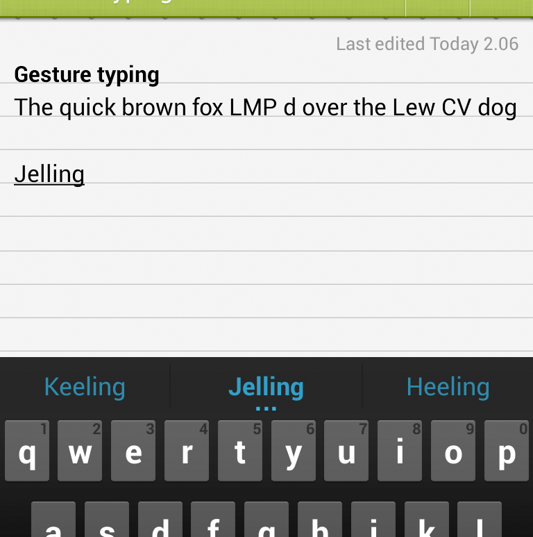
Then there's the new Gesture-typing keyboard. If your nails are a bit long, or your hands a bit sweaty, or you're wearing thin gloves, you may find it difficult to form basic words. As soon as your finger leaves the pad for a fraction of a second, your gesture is interrupted, spawning a bunch of syllables. Even if you continue swiping and the line continues cleanly. It seems the physics of how fast humans can move their fingers are ignored here in favor of blind sensor obedience. If a gripped finger strays into the pad from the side, it'll stop working altogether. Oh and don't try to type the word "jerking", it's not allowed. What do you think this is, a real keyboard?</p>

  <p>Finally if you use Google Talk, you get to enjoy a strange bug where it randomly gets stuck in a loop and forcibly scrolls to the bottom every couple of seconds, at random intervals, resulting in the most frustrating user-computer tug of war I've encountered. Fun times.</p>

</div></div>

<div class="g5"><div class="pad">
  <p><img src="https://acko.net/files/android/gesture-typing.png" alt="Gesture Typing" /></p>
</div></div>

<div class="g8 i2"><div class="pad">

  <h2 class="m3">It's For Your Own Good</h2>

  <p>Now, everyone knows headphones can damage your hearing. This is why the EU passed laws to help ensure consumers would be protected from themselves: devices like iPods are limited in the sound level they can emit. If you've ever sat next to someone and listened to the kacrunch-kacrunch that their hip-hop or dubstep sounded like to everyone on the outside, you may think this is a very good idea.</p>

  <p>Unfortunately, it takes a politician to think you could legislate against people being stupid, and a lawyer to come up with the convoluted verbiage that makes it seem sane to the rest of us. Then you need a developer to do a really hare-brained job in implementing it. Hence, in line with EU legislation, Android 4.2 introduces a new feature, for all users everywhere:</p>
  
</div></div>

<div class="g5"><div class="pad">

  <p><img src="https://acko.net/files/android/too-loud.png" alt="My spoon is too big" /></p>

  <div class="roboto">
    <p><strong>Only interrupt me if it's important</strong><br />“Like a good personal assistant, shield people from unimportant minutiae. People want to stay focused, and unless it's critical and time-sensitive, an interruption can be taxing and frustrating.”</p>
  </div>

  <div class="roboto">
    <p><strong>Get to know me</strong><br />“Learn peoples' preferences over time. Rather than asking them to make the same choices over and over, place previous choices within easy reach.”
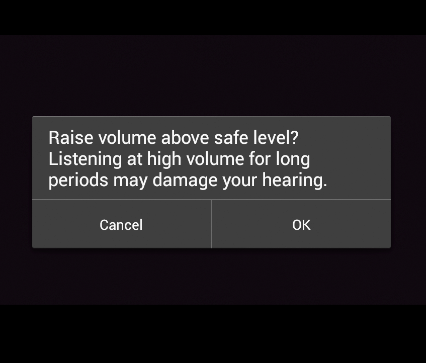
</p>
  </div>

</div></div>

<div class="g7"><div class="pad">

  <p>This pops up whenever the device <em>thinks</em> you're raising the volume above a safe level. I say 'thinks', because reports suggest the behavior differs based on what the phone is plugged into, with some users never seeing it, and others complaining about it endlessly. In any case, it's clearly broken for two reasons.</p>

  <p>One, it is ridiculous to think a phone could know whether the volume is unsafe: it could be plugged into a speaker dock, an amp or a recording device. Some headphones also have an additional volume control on the cord, and regardless, the amount of sonic power transferred depends on the design of the headphones and whether they fit the person's ears well.</p>

  <p>Two, the feature is designed in the most user-hostile manner. If the screen happens to be off or out of sight when you push the volume above 50%, you won't notice anything except that your button stops working until you wake up the screen and press "Ok". Worse, after a certain amount of play time has passed, the volume will automatically be kicked back to 50% and the pop-up will return, for that's what the law apparently requires. There's no way to disable this 'feature' permanently. Volume regulation on Android is broken from a user's point of view.</p>

  <p>Ridiculousness of law aside, there are any number of ways this could've been done more elegantly. An audible signal could be played along with the message, to provide feedback rather than failing quietly. Pressing volume up again (or twice more) should be interpreted as consent and dismiss the message. Users should be able to permanently disable the warning, for any situation where their hearing is not at risk, or for anyone who understands that banning smoking in parks doesn't make car exhaust any less toxic. And if the lawyers tell you to annoy the hell out of your users, only do it when you are absolutely sure it's required, not across the board, to everyone, with one of the most unimaginative implementations ever.</p>

  <p>Oh and notice how it charmingly blacked out the copy of Transformers that Play Movies was playing in the background when taking a screenshot. Google <em>Play</em> clearly excludes sharing, do keep that in mind.</p>

</div></div>

<div class="g8 i2"><div class="pad">
  
  <h2>The Wobbly Camera</h2>

  <p>Moving on, Android 4.2 includes a completely redesigned camera app, with fun features like Photo Sphere and a more minimal UI. It seems pretty slick and follows the crisp white-on-black style of Jelly Bean. However within 10 seconds of using it, it will eagerly show you how stupid it is:</p>
  
</div></div>

<div class="g6 m1"><div class="pad">

  <video width="480" height="360" controls="controls" style="max-width: 100%">
     <source src="https://acko.net/files/android/camera-flip.mp4" type="video/mp4" />
     <source src="https://acko.net/files/android/camera-flip.ogv" type="video/ogg" />
     <source src="https://acko.net/files/android/camera-flip.webm" type="video/webm" />
     <div>Your browser does not support the video tag.</div>
  </video>

</div></div>

<div class="g6"><div class="pad">

  <div class="roboto">
    <p class="m0"><strong>Make important things fast</strong><br />“Not all actions are equal. Decide what's most important in your app and make it easy to find and fast to use, like the shutter button in a camera, or the pause button in a music player.”</p>
  </div>

</div></div>

<div class="g6"><div class="pad">

  <div class="roboto">
    <p><strong>Delight me in surprising ways</strong><br />“A beautiful surface, a carefully-placed animation, or a well-timed sound effect is a joy to experience. Subtle effects contribute to a feeling of effortlessness and a sense that a powerful force is at hand.”</p>
  </div>

</div></div>

<div class="g8 i2"><div class="pad">

  <p>When you rotate the device from portrait to landscape, it freezes the screen so it can do a completely useless transition. The image doesn't change, the widgets don't actually move anywhere, the controls just rotate out and back in again, and the focus ring trips out for a bit.</p>

  <p>Somewhere, a Google developer probably realized this, thought about it, and said "Fuck it, I'll use <code>com.google.android.paint.by.numbers</code>" instead of handling the odd upside down case elegantly.</p>

  <p>Switching a camera from portrait to landscape is one of its main affordances. Android manages to jank even this up. To make matters worse, this minimal UI misses the mark: there is only one thing you can do with just one tap, and that's taking a picture. You can argue this makes the camera easier to handle, but I bet there's more than one Nexus 4 user who's never used the front camera, something more important than adjusting the white balance.</p>
  
</div></div>

<div class="c"></div>

<div class="wide mt2">
  <img src="https://acko.net/files/android/camera.jpg" alt="Android camera" />
</div>

<div class="c"></div>

<div class="g8 i2 m1"><div class="pad">

  <p>
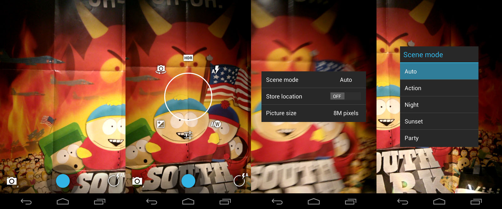
There's a button for toggling recording mode and a radial menu for everything else, but no labels or hints in sight, not even on confirmation. Meanwhile switching between the pre-set "scene modes" requires 4 taps and a buried menu, which either says "we forgot to include this in our wireframes" or "nobody really knows what this is for anyway".</p>

  <p>In the age of HDR imaging and live color filters, is there much reason to model a virtual camera after the confusing set-and-pray buttons of their physical counterparts, many of which only mimic film cameras to humor you?</p>

  <p>The Instagram-like filters that you can apply afterwards are functional, but the UI for applying effects and transforms is its own kind of weird, lacking useful feedback in several places. It also requires you to flick an invisible mirror to apply a mirroring effect, after pressing the Mirror button, I shit you not.</p>

  <p>The only thing that's genuinely clever about it though is how the camera acts like the newest picture frame in your gallery view, here on the left:</p>

</div></div>

<div class="g10 i1"><div class="pad">

  <p><img class="fit" src="https://acko.net/files/android/camera-strip.jpg" /></p>

</div></div>

<div class="g6"><div class="pad">

  <p>
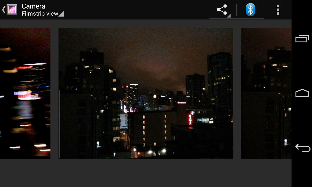
However even this view is hard to use, because it uses the most uncomfortable form of inertial scrolling and snap-to-item seen on the platform yet. It moves like a slot machine wheel, flipping over at the very end. Dear UI programmers: please go learn about easing and the equations of motion, you really can't arse your way around these things anymore, unless the demographic you were aiming for was grannies in Vegas.</p>

</div></div>

<div class="g6"><div class="pad">
  
  <div class="roboto">
    <p><strong>Real objects are more fun than buttons and menus</strong><br />“Allow people to directly touch and manipulate objects in your app. It reduces the cognitive effort needed to perform a task while making it more emotionally satisfying..”</p>
  </div>

</div></div>

<div class="c"></div>

<div class="g5 m4"><div class="pad">
  
  <p><img src="https://acko.net/files/android/network1.png" alt="network selection" /></p>

</div></div>

<div class="g7 m1"><div class="pad">

  <h2>
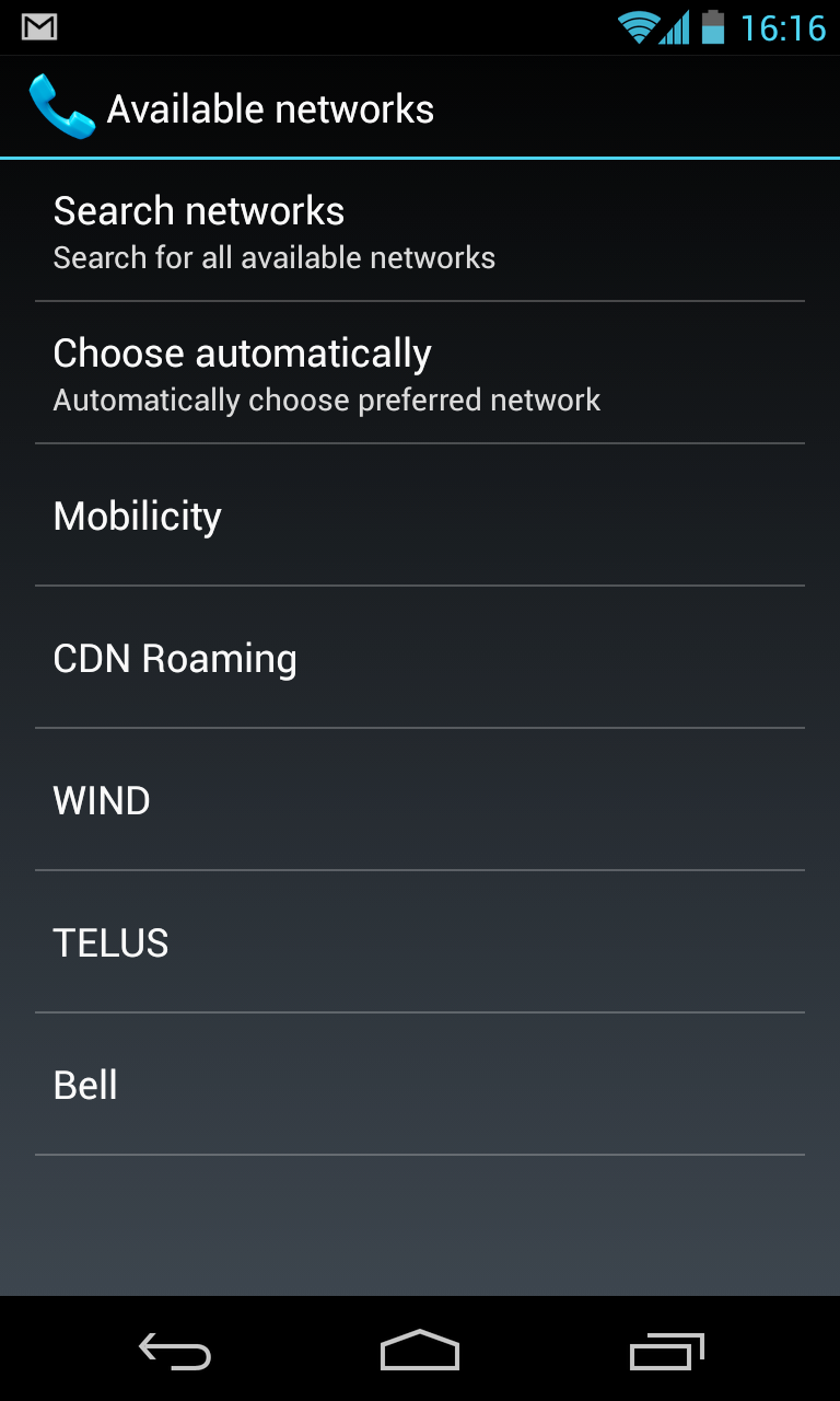
The Network Cocktease</h2>

  <p>But the most amazing example has to be the Network Operator screen. This dialog, normally buried, is presented when you lose connectivity. It's not just completely dysfunctional, but has remained unchanged for years. We're talking about the feature that turns your phone from a mostly useless brick into a node on the global voice and data network. It's kind of crucial when you need it.</p>

  <p>If you're here, it means something has changed. Either you've travelled to a foreign country, you've just spent a noticeable time out of cell range, something's wrong on your operator's end, or the <a href="https://code.google.com/p/android/issues/detail?id=2845">software messed up</a>. Your goal is simple: to confirm to the phone which network you'd like to use and <em>start to reconnect</em> right now, so you can get back to business.</p>

  <p>Unlike Wi-Fi, scanning for mobile networks can take a while. I've tried to dig into the relevant specs to see exactly why this is, and there doesn't seem to be a clear reason for it: networks advertise themselves, cell phones simply listen in, tuning to various channels to do so. But I may have missed something, given that 3GPP specs make W3C specs look like florid prose.</p>
  
  <p>Most users just want the phone to choose the right network automatically, selecting their home network if it's available, or roaming on a preferred partner. This is done using a list stored in the SIM card, and hence all known ahead of time. So what went wrong?</p>

</div></div>

<div class="c"></div>

<div class="wide mt2">
  <img src="https://acko.net/files/android/network2.png" alt="Android Network Selection 2" />
</div>

<div class="c"></div>

<div class="g8 i2 m1"><div class="pad">

  <p>
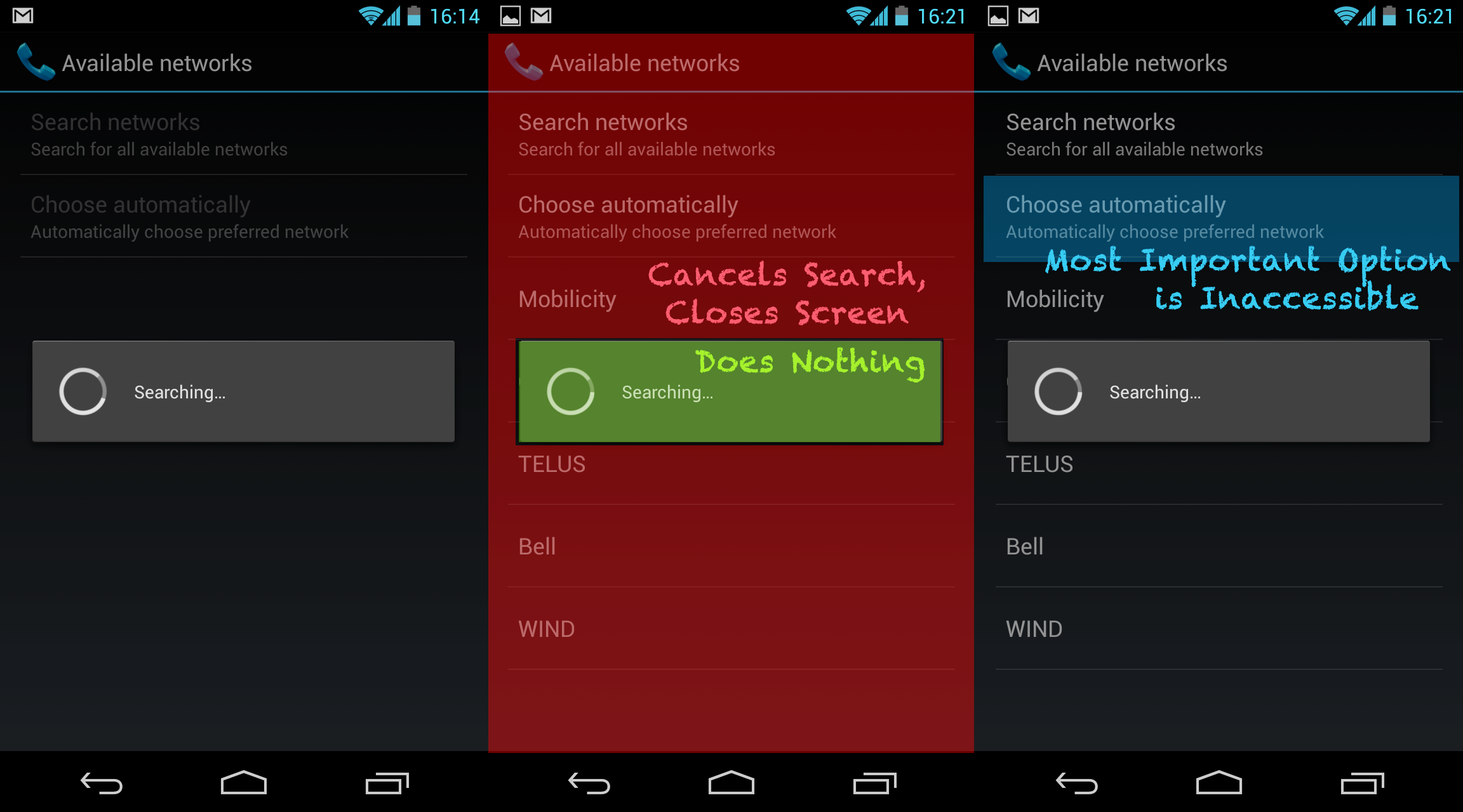
First, the obvious one: despite Android's emphasis on letting background processes and services run freely, scanning for network operators is a modal process. Scanning starts as soon as this screen is opened, and the only way to keep it open is to not touch anything. You have to wait until the phone finds all results to select one. Which means the 99% of users who wish to "Choose Automatically" have to wait for no reason.</p>

  <p>But suppose you're travelling and you've set your display timer to a modest 15 seconds to conserve battery. Now the screen will shut off before scanning has completed. You'll want to just let the phone sit for a bit and then pick it up again, right?</p>

  <p>Wrong. See, scanning completed ages ago. But because you weren't here to watch the phone do it, you can't actually select any of these options, because the modal popup will now never go away. Tapping it does nothing. Tapping in the dimmed area around it instantly closes the whole screen. If you try to return, the whole scanning process starts over again, because the results weren't even cached for 5 seconds.</p>

  <p>This is Utterly Broken. Users go here because they want to pick an option, so it should maximize their opportunity for doing so, not do the opposite and fail completely. If there is a preferred provider available, it should indicate that it knows this, not just suggestively put it at the top of the list while being coy about it.</p>

  <p>It's also a classic example of Google-Don't-Care: the Nexus One had this screen, the Nexus 4 still has it. Because most people only use this in unusual circumstances, it hasn't been on anyone's radar to merit fixing, despite several major OS revisions. But when you're walking around a foreign city, running late and needing to call someone, few things will make you want to toss your phone against a wall more than this.</p>

</div></div>

<div class="c"></div>

<div class="g6"><div class="pad">

  <div class="roboto">
    <p><strong>It's not my fault</strong><br />“Be gentle in how you prompt people to make corrections. They want to feel smart when they use your app. If something goes wrong, give clear recovery instructions but spare them the technical details. If you can fix it behind the scenes, even better.”</p>
  </div>

</div></div>

<div class="g6"><div class="pad">

  <div class="roboto">
    <p><strong>I should always know where I am</strong><br />“Give people confidence that they know their way around. Make places in your app look distinct and use transitions to show relationships among screens. Provide feedback on tasks in progress.”</p>
  </div>

</div></div>

<div class="c"></div>

<div class="g4 m3"><div class="pad">
  
  <p><img src="https://acko.net/files/android/clock1.png" alt="android clock: good" /></p>
  <p><img src="https://acko.net/files/android/clock2.png" alt="android clock: bad" /></p>
  <p><img src="https://acko.net/files/android/final.jpg" alt="my phone" /></p>

</div></div>

<div class="g8 m1"><div class="pad">

  <h2>The Times They Are A-Changing</h2>

  <p>Level such criticisms at any good Android fanboy though, and you'll hear back a common refrain: "Yes, but, things are changing! It takes time to change a developer culture."</p>

  <p>That would be valid, if some of the worst offenders weren't completely new in the latest upgrade. You can't set a good example with one mediocre experiment after another.</p>
  
  <p>The other rebuttal is, "There's a replacement app for that, that's the beauty of Android." And indeed, I do use a custom launcher and root my phone. But the result is still a series of apps, not a mobile desktop.</p>

  <p>The way I see it, there are basically four tiers of Android apps right now.</p>

  <p>
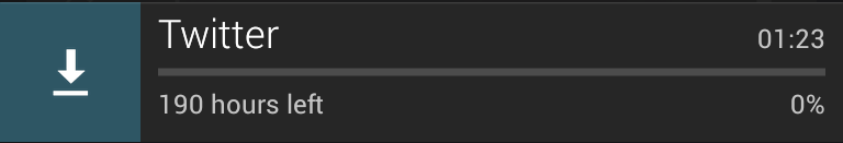
First, there's all the iOS apps that were ported over with no regard for the platform, which just feel like second-rate versions of better things. Luckily these are being replaced with native look-and-feel, with Twitter being a recent example.</p>

  <p>Second, there's the legacy of Android 2.x, whose widgets and pop ups still show up with alarming regularity, serving as a constant reminder to stay away from the Play Store as much as possible.</p>

  <p>Third, there's the mismatched Google apps from the No-Man's Land of Inbetween, like Play, Plus, Maps, Goggles, Reader and YouTube, which each have their own spin on the flatter UI with varying levels of blandness vs sophistication.</p>

  <p>Finally there's the modern Roboto Thin style of Jelly Bean, which oscillates strangely between a Braun-esque brilliance and a confusing form-over-function Sci-Fi UI not meant to be seen or used up close.</p>
  
  <p>There's nothing to tie it together but a bunch of disjoint cloud services. Are we all going to stay in our isolated messaging silos? Keep on emailing each other DropBox URLs? Substite mediocre AI for fine-grained control and precision?</p>

  <p>As an end-user, Android feels like it's a glimpse of something great now, but there are too many forces pulling it in different directions. If there's someone whose job it is to curate the Android experience and make it excel, their vision is not being realized effectively. Too much manual assembly is still required.</p>

</div></div>

<div class="g8 i2"><div class="pad">

  <p>The past decade, we've seen what was once just Apple's domain become mainstream, that is, bringing high-end UX design to software. But I can't help but feel some of the finesse has been lost. Gripes about iOS and OS X suggest the same is true for Apple as well.</p>

  <p>You hear a lot about "first time user experience" for example. But it's not about wrapping up your product like a present. It's about creating a connection of trust through empowerment and a little bit of emotional appeal: "This is for you, you can do amazing things with this." And that means "first-time" shouldn't refer to the first time you turn on the device, but the first time you use a device <em>for a particular purpose and context</em>. Travelling to Another Country should definitely be treated as a "first time" experience, same with How Do I Work This Camera, I Don't Have an App For This, I Don't Have Data Right Now, I Dropped It Down The Stairs, I Should've Cached This Map But I Didn't, My Friend Has a Windows Phone, etc. Throwing in more obnoxious tutorials is not the answer, creating affordance is.</p>
  
  <p>One of the most brilliant things Apple did for the iPhone was to make screenshots easy. People could show what they were doing with it, it empowered them to do so, popping up in articles and feeds. It took until Android 4 before you could do that without a USB debugger, so the only screenshots we got were taken by developers. Which platform has which image today? The iPhone isn't actually <em>that</em> intuitive, but most people already knew all about swiping and pinching by the time they picked one up for the first time. But the Android experience cannot come into its own when it's only chasing the walled gardens that already exist. It lacks agency for the user and pretends the cloud can pick up the slack.</p>

  <p>The most annoying part is, the worst bugs are well known, and the war over services is obvious. The issue tracker has long been full of reports and me-too-s and <a href="http://code.google.com/p/android/issues/detail?id=40365">dear-god-when-will-this-be-fixed</a>. Owning an Android means you accept having something that's always a bit broken, which doesn't integrate as well with anything you do as an iPhone does with its family, and just substitutes Google for Apple more and more. I'll stay on this side, I like my phone to be hackable, but that means being able to shut off the stupid warnings too, and having an OS actually worth hacking for.</p>

  <p>If the insides of this phone were as thoughtfully put together as the outside, Android could be to mobile what OS X was to the desktop in the 2000s. But so far, no dice.</p>

  <p>Above all, it's true what Steve Jobs said: Android is a stolen product. After so many years, there is little about the platform that can be said to set it apart from direct competitors. It's now just a mostly well done version of the same thing. I'm one of those old fogeys who has resisted getting a tablet, simply because I don't want a gianter phone. I want a <em>touch computer</em>, with everything that implies, not just something to do email and watch movies on.</p>

  <p><em>Quotes from: <a href="http://developer.android.com/design/get-started/principles.html">Android – Design Principles</a>, Google Inc. <a href="http://creativecommons.org/licenses/by/2.5/">(cc)</a></em></p>

</div></div>

]]></content>
  </entry>
  
  <entry>
    <title type="html"><![CDATA[Introducing Facing.me]]></title>
    <link href="https://acko.net/blog/introducing-facing-me/"/>
    <updated>2012-04-25T00:00:00+02:00</updated>
    <id>https://acko.net/blog/introducing-facing-me</id>
    <content type="html"><![CDATA[<div class="g8 i2 first"><div class="pad">

  <h2 class="sub">A unique way to meet people</h2>

</div></div>

<div class="c"></div>

<aside class="g5">
  <p class="tc">
    <img style="top: 0" src="/files/fme/facing.me.face.jpg" alt="Facing.me" />
  </p>
</aside>

<div class="g7"><div class="pad">

<p>
We've been sending out whispers for a while now, but it's finally out: a new web site called <a href="http://facing.me">Facing.me</a>. Coded and designed by <a href="http://mikejholly.com">Michael Holly</a>, <a href="http://rosshj.com/">Ross Howard-Jones</a> and myself, it promises a <em>unique way to meet people online</em>. This would be the point where the obvious question is dropped: wait, what… you built a <em>dating site</em>?</p>

<p>Sort of. Let me explain.</p>

<p>Having spent many years in the web world, we'd all gotten a bit complacent. The web has settled into its comfortable rhythms. Sites and applications can be modelled quickly and coded on your framework of choice. And nowadays, Web 2.0 cred comes baked in: clean URLs, semantic HTML, AJAX, data feeds, APIs, etc. Isn't this what we all wanted?</p>

<p>But the web continues to evolve, and giants are roaming the playground. Sites like Facebook and Twitter hold people's attention with surgical precision, while engines like Google answer your queries with lightning speed. Given that we've all slotted such services into our workflows and indeed lives, it seems only natural that 'indie' developers should keep up. We can't pretend that a 2000-era style web-page-with-ajax-sprinkles is the pinnacle of modern interactive design.</p>

<p>So we set out to try something different.</p>

</div></div>

<div class="img12">
  <a href="http://facing.me"><img src="/files/fme/facing.me.site.jpg" alt="Facing.me website" /></a>
</div>

<!--
<div class="g8 i2 first"><div class="pad">  

</div></div>
-->

<div class="g6"><div class="pad">

<h2>A Guy Walks into a Bar...</h2>

<p>If you've managed to score an invite, the first thing you'll see is the wall of faces that loads and fills the screen. The second thing you'll notice—we hope at least—is the lack of everything else.</p>

<p>The metaphor we kept in mind was the idea of walking into a bar, and looking around. If you see someone you like, you can go up to them and strike up a conversation. So that's exactly what the app lets you do, through video chat. You can pan around to see more people, and just keep going. If you're looking for something specific, you can filter your view with a simple "I'm looking for…" dialog.</p>

<p>As you mouse around, you can see who's online, and flip open their profile. If you want to strike up a video chat, it happens right there too. If the person is online, they'll see your request immediately in a popup and can choose to accept or decline after reviewing your profile. If they're offline, they'll see your request next time they visit.</p>

<p>To avoid missed connections, you can 'like' people you're interested in. You'll see (and hear) a notification pop up the moment they're online. You can keep the app open in a background tab and never miss a thing.</p>

<p>Aside from some minor social glue and a few fun little extras for you to discover, that's it. It's our twist on a <em>minimally viable product</em> if you will. Studies have shown that online matching algorithms are a poor predictor for how well people mesh in person. Until you meet face-to-face, you just don't know. We think direct, spontaneous video chat is a better first step rather than endless profile matching and messaging.</p>

</div></div>

<aside class="g6 m1">
  <p class="p0"><img src="/files/fme/facing.me.start.jpg" alt="Facing.me welcome screen" /></p>

  <p class="p0"><img src="/files/fme/facing.me.profile.jpg" alt="Facing.me welcome screen" /></p>

  <p class="p0"><img src="/files/fme/facing.me.growl.jpg" alt="Facing.me notification" /></p>

  <p class="p0"><img src="/files/fme/facing.me.like.jpg" alt="Facing.me liking" /></p>
</aside>

<div class="g8 i2"><div class="pad">

<h2>Polishing Bacon</h2>

<p>But despite its minimalism, a big aspect of Facing.me is the effort and care we put into it. Our goal was to achieve a level of polish typically reserved for premium iPhone apps and bring it into the browser. We wrapped the whole thing in a crisp design, enhanced with tasteful web fonts. But most importantly, we sought to expose the app's functionality with as little interruption as possible. To do that, we layered on plenty of transitions driven by CSS3 and JavaScript, and stream in data and content as needed.</p>

<p>Based on previous work in custom animations—and <a href="/blog/abusing-jquery-animate-for-fun-and-profit-and-bacon">bacon</a>—we refined the approach of using jQuery as an animation helper for completely custom transitions. We tell jQuery to animate placeholder properties on orphaned proxy divs, and key off those animations with per-frame code to drive the fancy stuff.</p>

</div></div>

<div class="img12">
  <img src="/files/fme/transition.jpg" alt="facing.me animation example" />
</div>

<div class="g8 i2"><div class="pad">
<p>As a result, we can have a photo grow a picture frame as you pick it up, and then flip it around to show a person's full profile. This careful choreography involves animating about a dozen CSS properties, including borders, shadows, margins and 3D transforms, all with custom expressions and hand-tuned animation curves. Similar transitions are used for lightbox dialogs.</p>

<p>Throughout all of this, the animations remain eminently manageable. We can interrupt and reverse them at any point, and run multiple copies at the same time, thanks to pervasive use of view controllers. Far from being a useless tech demo, it actually enables us to craft the user experience exactly the way we like it: being able to acknowledge user intentions with intuitive feedback no matter what's going on, and firing off new events and requests without worrying about the internal state. Gone are the fragile jQuery behavior soups of old.</p>

<p>The one downside is that only the newer browsers—i.e. Chrome, Safari and Firefox—get to see everything the way it was intended. And actually the performance in Firefox is still a bit disappointing. IE9 users will have to be satisfied with a crude 2D approximation until IE10 comes out.</p>

</div></div>

<div class="g8 first"><div class="pad">

<h2>Rapid Rails and Real-Time Node</h2>

<p>To make all this work effectively on the server-side, we used a dual-mode stack of Rails and Node.js.</p>

<p>The Rails side houses the app's models and controllers, and provides an API for all the client-side JavaScript to do its job. Video chats are handled through Flash and routed through its built-in peer-to-peer functionality.</p>

<p>The node.js component acts as a real-time presence daemon which users connect to over socket.io. It's used to drive the status notifications and to coordinate the video chats. We can exchange any sort of notifications between users with a publish-subscribe model, opening up many interesting avenues for future development.</p>

<p>Overall, this approach has worked out great. Rails' ActiveRecord and the stack around it allowed us to build out functionality quickly and with just the right amount of necessary baggage. We made generous use of Ruby Gems to save time while still maintaining full control.</p>

<p>Node.js's event-driven model adds real-time signalling with no hassle. For the few cases where node.js needs to interface with the Rails database directly, we slot in some manual SQL to take care of that. For everything else, Rails and node.js exchange signed data through the browser.</p>

</div></div>

<aside class="g4 m1"><div class="pad">
  <p><img src="/files/fme/nodejs.png" alt="Node.js" /></p>

  <p><img src="/files/fme/rails.jpg" alt="Rails" /></p>
</div></aside>

<div class="g8 i2 first"><div class="pad">

<h2>Come Take it for a Spin</h2>

<p>Finally, we also put our heads together and made a promo video, voiced by the lovely <a href="https://twitter.com/t1nah">Tina Hoang</a>:</p>

</div></div>

<div style="max-width: 854px; width: 100%; margin: 0 auto">

  <iframe src="http://player.vimeo.com/video/41056588?title=0&amp;byline=0&amp;portrait=0" width="854" height="480" frameborder="0" allowfullscreen="allowFullScreen"></iframe>

</div>

<div class="g8 i2"><div class="pad">

<p>Built in our spare time by just 3 guys in a virtual garage, we're pretty proud of the end result. We'd love for you to take it for a spin, so <a href="http://facing.me">head over to facing.me</a> and grab yourself an invite. There's a feedback form built-in, and any suggestions are welcome.</p>

<p>Discuss on <a href="https://plus.google.com/112457107445031703644/posts/efHMJE1Wxx2">Google Plus</a>.</p>

</div></div>
]]></content>
  </entry>
  
  <entry>
    <title type="html"><![CDATA[Abusing jQuery.animate for fun and profit (and bacon)]]></title>
    <link href="https://acko.net/blog/abusing-jquery-animate-for-fun-and-profit-and-bacon/"/>
    <updated>2008-09-22T00:00:00+02:00</updated>
    <id>https://acko.net/blog/abusing-jquery-animate-for-fun-and-profit-and-bacon</id>
    <content type="html"><![CDATA[<div class="g8 i2 first"><div class="pad"><p>The days of static UIs that only have jarring transitions between pages are pretty much over. With frameworks like <a href="http://developer.apple.com/documentation/Cocoa/Conceptual/CoreAnimation_guide/Introduction/Introduction.html">CoreAnimation</a> or <a href="http://jquery.com">jQuery</a>, it's easy to add useful animations to applications and webpages. In the case of jQuery, you can easily animate any CSS property, and you get free work-arounds for browser bugs to boot. You can run multiple animations (of arbitrary duration) at the same time, queue animations and even animate complex properties like colors or clipping rectangles.
</p>


<aside class="r m1"><img class="natural" src="/files/bacon/bacon1.png" style="width: 100px" alt="Strip of bacon" /></aside>

<p>But what if you want to go beyond mere CSS? You might have a custom widget that is drawn using <code>&lt;canvas&gt;</code>, whose contents are controlled by internal variables; maybe you're using 3D transformations to scale and position images on a page, and simple 2D tweening just doesn't cut it.
</p>

<p>
In that case, it would seem you are out of luck: jQuery's .animate() method can only be applied to a collection of DOM elements, and relies heavily on the browser's own semantics for processing CSS values and their units. However thanks to JavaScript's flexibility and jQuery's architecture, we can work around this, and re-use jQuery's excellent animation core for our own nefarious purposes.
</p>

<h2>Hackity hack hack</h2>

<p>
First, we need an object to store all the variables we wish to animate. We use an anonymous <code>&lt;div&gt;</code> outside of the main document, so that jQuery's DOM calls still work on it. We simply add our own properties to it:
</p>

<p class="codeblock">
<code>var&nbsp;vars&nbsp;=&nbsp;$.extend($('&lt;div&gt;')[0],&nbsp;{<br />
&nbsp;&nbsp;foo:&nbsp;1,<br />
&nbsp;&nbsp;bar:&nbsp;2,<br />
<br />
&nbsp;&nbsp;customAnimate:&nbsp;true,<br />
&nbsp;&nbsp;updated:&nbsp;true<br />
});<br />
</code>
</p>

<p>
In this case, our properties are <code>foo</code> and <code>bar</code>. We also set <code>customAnimate</code> and <code>updated</code> to identify this object (see below).
</p>

<p>
Next we need to override jQuery's default step function, which gets called for every step of an animation, and applies new values to an element's CSS properties.
</p>

<p class="codeblock">
<code>&nbsp;&nbsp;&nbsp;//&nbsp;jQuery.fx.step._default<br />
&nbsp;&nbsp;&nbsp;&nbsp;_default:&nbsp;function(fx)&nbsp;{<br />
&nbsp;&nbsp;&nbsp;&nbsp;&nbsp;&nbsp;fx.elem.style[fx.prop]&nbsp;=&nbsp;fx.now&nbsp;+&nbsp;fx.unit;<br />
&nbsp;&nbsp;&nbsp;&nbsp;}<br />
</code>
</p>

<p>
We can replace it using the following snippet:
</p>

<p class="codeblock">
<code>var&nbsp;$_fx_step_default&nbsp;=&nbsp;$.fx.step._default;<br />
$.fx.step._default&nbsp;=&nbsp;function&nbsp;(fx)&nbsp;{<br />
&nbsp;&nbsp;if&nbsp;(!fx.elem.customAnimate)&nbsp;return&nbsp;$_fx_step_default(fx);<br />
&nbsp;&nbsp;fx.elem[fx.prop]&nbsp;=&nbsp;fx.now;<br />
&nbsp;&nbsp;fx.elem.updated&nbsp;=&nbsp;true;<br />
};<br />
</code>
</p>

<p>
With the new step function, jQuery will check for the presence of a <code>customAnimate</code> property on any element it is animating. If present, it will assign the (unit-less) value to <code>element.property</code> rather than <code>element.style.property</code> and mark the element by setting <code>element.updated</code> to true.
</p>

<p>
Now we're ready to animate, using the normal <code>$.animate</code> syntax:
</p>

<p class="codeblock">
<code>$(vars).animate({&nbsp;foo:&nbsp;5,&nbsp;bar:&nbsp;10&nbsp;},&nbsp;{&nbsp;duration:&nbsp;1000&nbsp;});<br />
</code>
</p>

<p>
The values <code>vars.foo</code> and <code>vars.bar</code> will now smoothly change over time. You can use any of <a href="http://docs.jquery.com/Effects/animate">jQuery's animation abilities</a> as usual.
</p>

<p>
Now what about that <code>updated</code> variable? Well to actually use these animated values, you will need some kind of timer or step callback to read them back and draw them on the page. If you're using <code>&lt;canvas&gt;</code>, you need to redraw your entire widget for every change, but you don't want to be wasting CPU time by constantly refreshing it. Furthermore, if you're running multiple animations at the same time, you'll want to aggregate all your property changes into a single redraw per frame. This is easy with the <code>updated</code> property and a simple timer:
</p>

<p class="codeblock">
<code>setInterval(function&nbsp;()&nbsp;{<br />
&nbsp;&nbsp;if&nbsp;(!vars.updated)&nbsp;return;<br />
&nbsp;&nbsp;vars.updated&nbsp;=&nbsp;false;<br />
&nbsp;&nbsp;<br />
&nbsp;&nbsp;drawWidget();<br />
},&nbsp;30);<br />
</code>
</p>

<p>
Now your widget will only refresh itself when its values are changed by the animation step function we defined earlier, and very few CPU cycles are wasted. As a plus, you can render updates as fast or as slow as you want, without affecting the duration of your animations.
</p>

<h2>Demo</h2>

<p>
I whipped up a quick demo which renders a <a href="/files/bacon/animation-demo.html">cloud of bacon</a> using <code>&lt;canvas&gt;</code>. All the motion in the demo is created through <code>$.animate()</code>, with a bunch of animations running at once.
</p>

<p>
<small><em>This demo will not work in Internet Explorer, and has only been tested in Firefox 3 and Safari 3.</em></small>
</p>

<p>
This is a rather esoteric example, but there are plenty of useful ways to apply this technique. I've used it to implement <a href="/files/bacon/omgpizza.mov">smooth, beautiful, usable widgets</a>. You can combine multiple motion and opacity animations triggered by clicks and hovers without issues.
</p>
 
<h2>Final notes</h2>

<p>
While this technique works great, there is one big caveat. You should avoid animating any property that exists in CSS ('float', 'display', 'opacity', ...) because these have unexpected side effects depending on the browser.
</p>

<p>
There are also a couple of weaknesses:
</p>

<ul>
  <li>jQuery does not support continued easing. That is, when you override an animation that is already in progress, the variable being animated will instantly stop and restart from its current position. The rate of change is not continuous between the two animations.</li>
  <li>Animating angles is tricky. E.g. when animating from 350˚ to 0˚, you want it to animate across 10˚ and not the long way around. This requires manual correction.</li>
</ul>

<p>
And obviously, it would be cleaner if jQuery's animation core was refactored to separate out the CSS-specific code instead...
</p>

</div></div>
]]></content>
  </entry>
  
  <entry>
    <title type="html"><![CDATA[Nokia N73 Review]]></title>
    <link href="https://acko.net/blog/nokia-n73-review/"/>
    <updated>2007-01-31T00:00:00+01:00</updated>
    <id>https://acko.net/blog/nokia-n73-review</id>
    <content type="html"><![CDATA[<div class="g8 i2 first"><div class="pad"><p>Two months ago I got a Nokia N73 hand-me-down from <a href="http://www.rolandtanglao.com/tags/nokia-blogger-relations">Roland</a> thanks to Nokia's Blogger Relations Program. It's a 'smart phone' with a large 320x240 screen, a 3 megapixel camera and more. Before this, I'd been using an old Nokia 3310 brick (monochrome screen) so this was quite a step up. Still, I wasn't particularly unhappy with my old phone because all I really needed was voice calls and SMS. So I was curious myself to see if I'd actually use all the bells and whistles.
</p>

<p>
<div style="text-align: center;"><img class="natural" src="/files/n73/n73.jpg" alt="Nokia N73" /></div>
</p>

<p>
The good news is that making calls and sending text messages has become easier. The default interface has a quick launch bar to access contacts, text messages and other features. Selecting a contact by typing some letters is fast and accurate, and the big screen is easy to read. I also have no problems using predictive text input thanks to years of SMS'ing, while the improved controls (such as the 4-way stick) make entering symbols easier.
</p>

<p>
Managing my contacts is now a non-issue. I edit my entire address book in Mac OS X and just sync it to the phone, including everyone's pictures. Plus, with <a href="http://www.adiumx.com/">Adium</a> address book syncing, this means that it automatically imports IM icons for contacts that don't yet have a picture. However, I did try editing contacts on the phone itself, and it was way too complicated.
</p>

<p>
Now, the first phone feature I really enjoyed was the built-in camera. Unlike most camera phones, the N73 has a pretty good camera and lens, with auto-focus and all the works. The phone also has a flip cover, so to take a picture, you just slide open the cover on the back and hold it like a real camera (including holding down the snap button half-way for focus). There is even a button to go straight to your pictures.
</p>

<p>
However, there is a big annoyance here: it takes 5-7 seconds to open the camera application. This is way too long and makes it impossible to snap spontaneous pictures. Also, in spite of all the technical wizardry, pictures in low-light conditions and at night look very bad and washed out. The pictures it takes are also compressed too much. There's a 1GB memory card in mine, so I really wish I could save images to (near-)lossless JPEG.
</p>

<p>
<div style="text-align: center;"><a href="http://www.flickr.com/photos/unconed/315186883/" title="Photo Sharing"><img class="natural" src="http://farm1.static.flickr.com/120/315186883_1c40e05ee2.jpg" width="500" height="375" alt="View from the office" /></a></div>
</p>

<p>
The second interesting feature was the MP3 player, especially in light of the 1GB of storage which would fit a lot of music. I even found a nice OS X app iTuneMyWalkman that automatically syncs iTunes playlists for me.
</p>

<p>
However, the phone's music player is simply horrible. The UI makes no use of the N73's buttons: I'd expect to be able to fast forward or backward by holding the stick left/right, and clicking it left/right to go to another song. Instead, you have to press up/down to reach the right on-screen button and then press the stick to push it.
</p>

<p>
Even more annoying is that leaving the music player stops all playback. If you wish to use the N73 like a real MP3 player, you have to go into a context-menu, scroll down and select "Play in background", then lock the keypad from the main screen every single time. The current behaviour only makes sense if you wish to listen to random audio clips at random moments, which I really don't see myself doing.
</p>

<p>
To top it all off, there's the fact that you can only use the official Nokia headphones with the N73, because they have a proprietary connector. I already have headphones for my laptop and I don't want to carry another set around.
</p>

<p>
Next, I've gotten to really like the calendar and the alerts it can provide. However, here I also stick to iCal on OS X and simply sync all my events to the phone. The phone's own calendar input is, again, clunky and cumbersome to use.
</p>

<p>
After this, I looked at the other capabilities of the phone. A highlight is the included Snakes game, which is in full 3D and features whacky snake action on square and hexagonal grids, even on curved surfaces. I've played it several times while queueing up for various things, and it's fun and easy to pick up. Bonus points for the automatic checkpointing of your progress in the game.
</p>

<p>
For playing video, the phone uses RealPlayer. Now, I realize this might sound a bit irrational, but I for one don't want anything to do with Real. They have screwed over their users for years on end producing ridiculously crappy players bundled with some of the most insidious spyware and adware seen. But even disregarding that, RealPlayer is a horrible choice as it doesn't play any of the most popular video formats, like DivX or QuickTime. With open-source players like VLC being able to play every format under the sun, there is really no excuse for this.
</p>

<p>
As for the internet features, I can't try them out because I have no data plan. It's apparently impossible to get an unlimited data plan in Vancouver, unless you get a Hiptop or have connections.
</p>

<p>
Finally, more small annoyances:
</p>

<ul>
  <li>The Nokia proprietary connector is almost-symmetrical, which means half of the time I'm trying to plug it in the wrong way.</li>
  <li>The default setup and some of the applications (like the photo browser) contain annoying plugs for online services and various lame ideas (like Nokia Lifeblog). Most cannot be removed and just get in the way.</li>
  <li>The phone always complains I unplugged it incorrectly after using the USB data cable. I haven't found any 'right' way to unplug it (and yes, I do unmount/eject the drive in OS X).</li>
  <li>The phone automatically formats the memory card in an obscure directory tree that mixes user-owned content with system libraries and applications. Images and video are saved in nested subdirectories with a weird numerical format that includes a sequence number and date, but not a single separator character. When was 28012007240.jpg taken?</li>
  <li>There is an utterly useless second "Quick launch" button that pops up an elaborate directional menu where you can choose up/left/right to pick a command. Of course, all that window dressing means it's actually terribly slow to use. It's an embarrasingly bad waste of a button and cannot be replaced or disabled.</li>
  <li>The data cable's connector is flaky and will disconnect momentarily if you fiddle with the phone while it's plugged in.</li>
  <li>The default menu setup is bizzare. Some features are located at the top level, some are inside "Tools", some are inside "Applications", some are inside "Downloads!" (yes, with exclamation mark). Luckily you can rearrange this to your liking.</li>
  <li>The keyboard is really small vertically, yet there is a lot of wasted space. Bigger buttons would be nice.</li>
</ul>
  
<p>
  After two months, the only thing I've consistently used other than voice calls and SMS is the camera, because it is really good for a phone. All the pictures on my <a href="http://flickr.com/photos/unconed/">Flickr page</a> since December 1st were taken with the N73. I also listen to music whenever I can, but the MP3 player and proprietary headphones are too cumbersome.
</p>

<p>
The only part of the N73 that really stands out for me is the phone's form factor. I love that in spite of all its features, it's only as big as a typical phone. It's clearly designed for snapping pictures with and the screen is large and gorgeous. If the data-cable and file system didn't suck so much, I'd probably use it as a USB stick too (or better, if you could mount Bluetooth storage as local, ejectable drives).
</p>

<p>
Having used this phone, I can clearly see why traditional cellphone makers should fear Apple's iPhone. I've consistenty avoided using the phone's built-in tools like address book and calendar editing, because doing it on my Mac is orders of magnitude easier and faster. From what I've seen, the iPhone changes that. I really wish the iPhone will bring a fresh wave of usability improvements for mobile devices. But, if usability was all that mattered, we wouldn't be seeing so many Windows installs out there either...</p></div></div>
]]></content>
  </entry>
  
  <entry>
    <title type="html"><![CDATA[Making Drupal smarter]]></title>
    <link href="https://acko.net/blog/making-drupal-smarter/"/>
    <updated>2007-01-19T00:00:00+01:00</updated>
    <id>https://acko.net/blog/making-drupal-smarter</id>
    <content type="html"><![CDATA[<div class="g8 i2 first"><div class="pad"><p>One of the things I worked on for Drupal 5 was to make Drupal smarter about itself. For example, the new status report tells you about security or maintenance problems, and can alert you if you need to run update.php after updating a module. These warnings are also pushed out to the main administration page.
</p>

<p>
This is a significant improvement in usability, as we try to make site set up and maintenance as painless as possible. The user can focus on the things they care about. If there is something that needs the admin's attention, it is clearly indicated.
</p>

<p>
The inspiration for this came from OS X. There are some really great examples of this in both Apple and third-party applications.
<!--break-->
For example, Mail.app automatically figures out if your mail server requires SSL or not: it simply tries both and sees which works when you set up the account. It happens transparently.
</p>

<p>
NewsFire does something similar. When you click the "Add feed" button, it automatically takes any URL on the clipboard, pings it and fetches the feed title (provided it points to a valid feed). All you need to do is press ok on the pre-filled form. If there is no URL on the clipboard, you get a blank form.
</p>

<p>
With our new _install and _enable hooks, and _requirements to examine the server environment, Drupal 5 modules have a lot of more opportunities to 'do the right thing' transparently. 
</p>

<p>
We should encourage this practice as much as possible. Modules that require Drupal's configuration to match certain settings should make sure they are set correctly. If the setting is relatively benign and related to the module's purpose, it can be set automatically. Otherwise, it can be a requirement for the module to be installed/enabled.
</p>

<p>
We do need to walk a fine line between information overload and too much magic. But I think we've managed to do fine so far.
</p></div></div>
]]></content>
  </entry>
  
  <entry>
    <title type="html"><![CDATA[jQuery Menu Scout]]></title>
    <link href="https://acko.net/blog/jquery-menu-scout/"/>
    <updated>2006-12-07T00:00:00+01:00</updated>
    <id>https://acko.net/blog/jquery-menu-scout</id>
    <content type="html"><![CDATA[<div class="g8 i2 first"><div class="pad"><p><em><strong>Updated video</strong>: now also highlights deep links (though gray, not white), bubbles are prettier and aligned better and video capture is smoother. I also changed the music to please termie.</em>
</p>

<p>
Out of a whacky conversation on IRC comes the latest treat for <a href="http://drupal.org/">Drupal 5.0</a>.
</p>

<p>
The new administration section is nice, but it's a big adjustment for 4.7 users. It's not immediately obvious where to go to find a certain option. Wouldn't it be handy if you could find any administration page with a couple of keystrokes? Something like Apple Spotlight?
</p>

<p>
Today's usability special: a nice slice of jQuery with some search module on the side, sprinkled with menu magic and topped off with some sexy CSS. Feast your eyes on this:
</p>

<p>
<div style="text-align: center;">
<a href="/files/drupal-menu-scout/Drupal%20Menu%20Scout.mp4"><img class="natural" src="/files/drupal-menu-scout/help_guide.png" alt="jQuery/Search module powered menu scout." /></a><br />(MPEG-4 movie)
</div>
</p>

<p>
Patch is <a href="http://drupal.org/node/102254">available on drupal.org</a>.</p></div></div>
]]></content>
  </entry>
  
</feed>
