Looking back, and forward

Lately, it seems popular to talk smack about React. Both the orange and red site recently spilled the tea about how mean Uncle React has been, and how much nicer some of these next-gen frameworks supposedly are.
I find this bizarre for two reasons:
- Most next-gen React spin-offs strike me as universally regressive, not progressive.
- The few exceptions don't seem to have any actual complex, battle-hardened apps to point to, to prove their worth.
Now, before you close this tab thinking "ugh, not another tech rant", let me first remind you that a post is not a rant simply because it makes you angry. Next, let me point out that I've been writing code for 32 years. You should listen to your elders, for they know shit and have seen shit. I've also spent a fair amount of time teaching people how to get really good at React, so I know the pitfalls.
You may also notice that not even venerated 3rd party developers are particularly excited about React 18 and its concurrent mode, let alone the unwashed masses. This should tell you the React team itself is suffering a bit of an existential crisis. The framework that started as just the V in MVC can't seem to figure out where it wants to go.
So this is not the praise of a React fanboy. I built my own clone of the core run-time, and it was exactly because its limitations were grating, despite the potential there. I added numerous extensions, and then used it to tackle one of the most challenging domains around: GPU rendering. If one person can pull that off, that means there's actually something real going on here. It ties into genuine productivity boons, and results in robust, quality software, which seems to come together as if by magic.
To put it differently: when Figma recently announced they were acquired for $20B by Adobe, we all intuitively understood just how much of an exceptional black swan event that was. We know that 99.99…% of software companies are simply incapable of pulling off something similar. But do we know why?

Where we came from
If you're fresh off the boat today, React can seem like a fixture. The now-ancient saying "Nobody ever got fired for choosing IBM" may as well be updated for React. Nevertheless, when it appeared on the scene, it was wild: you're going to put the HTML and CSS in the JavaScript? Are you mad?
Yes, it was mad, and like Galileo, the people behind React were completely right, for they integrated some of the best ideas out there. They were so right that Angular pretty much threw in the towel on its abysmal two-way binding system and redesigned it to adopt a similar one-way data flow. They were so right that React also dethroned the previous fixture in web land, jQuery, as the diff-based Virtual DOM obsoleted almost all of the trickery people were using to beat the old DOM into shape. The fact that you could use e.g. componentDidUpdate to integrate legacy code was just a conceit, a transition mechanism that spelled out its own obsolescence as soon as you got comfortable with it.
Many competing frameworks acted like this wasn't so, and stuck to the old practice of using templates. They missed the obvious lesson here: every templating language inevitably turns into a very poor programming language over time. It will grow to add conditionals, loops, scopes, macros, and other things that are much nicer in actual code. A templating language is mainly an inner platform effect. It targets a weird imagined archetype of someone who isn't allergic to code, but somehow isn't smart enough to work in a genuine programming language. In my experience, this archetype doesn't actually exist. Designers don't want to code at all, while coders want native expressiveness. It's just that simple.
Others looked at the Virtual DOM and only saw inefficiency. They wanted to add a compiler, so they could reduce the DOM manipulations to an absolute minimum, smugly pointing to benchmarks. This was often just premature optimization, because it failed to recognize the power of dynamic languages: that they can easily reconfigure their behavior at run-time, in response to data, in a turing-complete way. This is essential for composing grown up apps that enable user freedom. The use case that most of the React spin-offs seem to be targeting is not apps but web sites. They are paving cow paths that are well-worn with some minor conveniences, while never transcending them.
var RouterMixin = {
  contextTypes: {
    router: React.PropTypes.object.isRequired
  },

  // The mixin provides a method so that
  // components don't have to use the
  // context API directly.
  push: function(path) {
    this.context.router.push(path)
  }
};

var Link = React.createClass({
  mixins: [RouterMixin],

  handleClick: function(e) {
    e.stopPropagation();

    // This method is defined in RouterMixin.
    this.push(this.props.to);
  },

  render: function() {
    return (
      <a onClick={this.handleClick}>
        {this.props.children}
      </a>
    );
  }
});

module.exports = Link;
React circa 2016
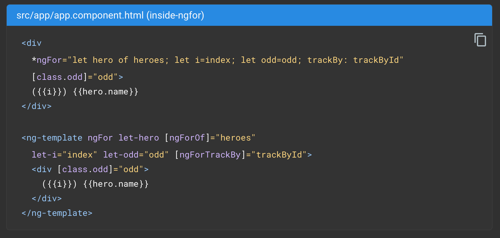
It's also easy to forget that React itself had many architectural revisions. When old farts like me got in on it, components still had mix-ins, because genuine classes were a distant dream in JS. When ES classes showed up, React adopted those, but it didn't fundamentally change the way you structured your code. It wasn't until React 16.8 (!) that we got hooks, which completely changed the way you approached it. This reduced the necessary boilerplate by an order of magnitude, and triggered a cambrian explosion of custom hook development. That is, at least until the buzz wore off, and only the good ideas remained standing.
Along the way, third party React libraries have followed a similar path. Solutions like Redux appeared, got popular, and then were ditched as people realized the boilerplate just wasn't worth it. It was a necessary lesson to learn.
This legacy of evolution is also where the bulk of React's perceived bloat sits today. As browsers evolved, as libraries got smarter, and as more people ditched OO, much of it is now indeed unnecessary for many use cases. But while you can tweak React with a leaner-and-meaner reimplementation, this doesn't fundamentally alter the value proposition, or invalidate the existing appeal of it.
The fact remains that before React showed up, nobody really had any idea how to make concepts like URL routers, or drag and drop, or UI design systems, truly sing, not on the web. We had a lot of individual pieces, but nothing solid to puzzle them together with. Nevertheless, there is actual undiscovered country beyond, and that's really what this post is about: looking back and looking forward.
If there's one solid criticism I've heard of React, it's this: that no two React codebases ever look alike. This is generally true, but it's somewhat similar to another old adage: that happy families all look alike, but every broken family is broken in its own particular way. The reason bad React codebases are bad is because the people who code it have no idea what they're supposed to be doing. Without a model of how to reason about their code in a structured way, they just keep adding on hack upon hack, until it's better to throw the entire thing away and start from scratch. This is no different from any other codebase made up as they go along, React or not.
Where React came from is easy to explain, but difficult to grok: it's the solution that Facebook arrived at, in order to make their army of junior developers build a reliable front-end, that could be used by millions. There is an enormous amount of hard-earned experience encoded in its architecture today. Often though, it can be hard to sort the wheat from the chaff. If you stubbornly stick to what feels familiar and easy, you may never understand this. And if you never build anything other than a SaaS-with-forms, you never will.
I won't rehash the specifics of e.g. useEffect here, but rather, drop in a trickier question: what if the problem people have with useEffect + DOM Events isn't the fault of hooks at all, but is actually the fault of the DOM?
I only mention it because when I grafted an immediate-mode style interaction model onto my React clone instead, I discovered that complex gesture controllers suddenly became 2-3x shorter. What's more, declaring data dependencies that "violate the rules of React" wasn't an anti-pattern at all: it was actually key to the entire thing. So when I hear that people are proudly trying to replace dependencies with magic signals, I just shake my head and look elsewhere.
Which makes me wonder… why is nobody else doing things like this? Immediate mode UI isn't new, not by a long shot. And it's hardly the only sticking point.

Mac OS X Leopard - 2007
Where we actually came from
Here's another thing you may not understand: just how good old desktop software truly was.
The gold standard here is Mac OS X, circa 2008. It was right before the iPhone, when Apple was still uniquely focused on making its desktop the slickest, most accessible platform around. It was a time when sites like Ars Technica still published real content, and John Siracusa would lovingly post multi-page breakdowns of every new release, obsessing over every detail for years on end. Just imagine: tech journalists actually knowing the ins-and-outs of how the sausage was made, as opposed to copy/pasting advertorials. It was awesome.
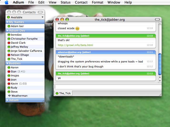
This was supported by a blooming 3rd party app ecosystem, before anyone had heard of an App Store. It resulted in some genuine marvels, which fit seamlessly into the design principles of the platform. For example, Adium, a universal instant messenger, which made other open-source offerings seem clunky and downright cringe. Or Growl, a universal notification system that paired seamlessly with it. It's difficult to imagine this not being standard in every OS now, but Mac enthusiasts had it years before anyone else.
The monopolistic Apple of today can't hold a candle to the extended Apple cinematic universe from before. I still often refer to the Apple Human Interface Guidelines from that era, rather than the more "updated" versions of today, which have slowly but surely thrown their own wisdom in the trash.
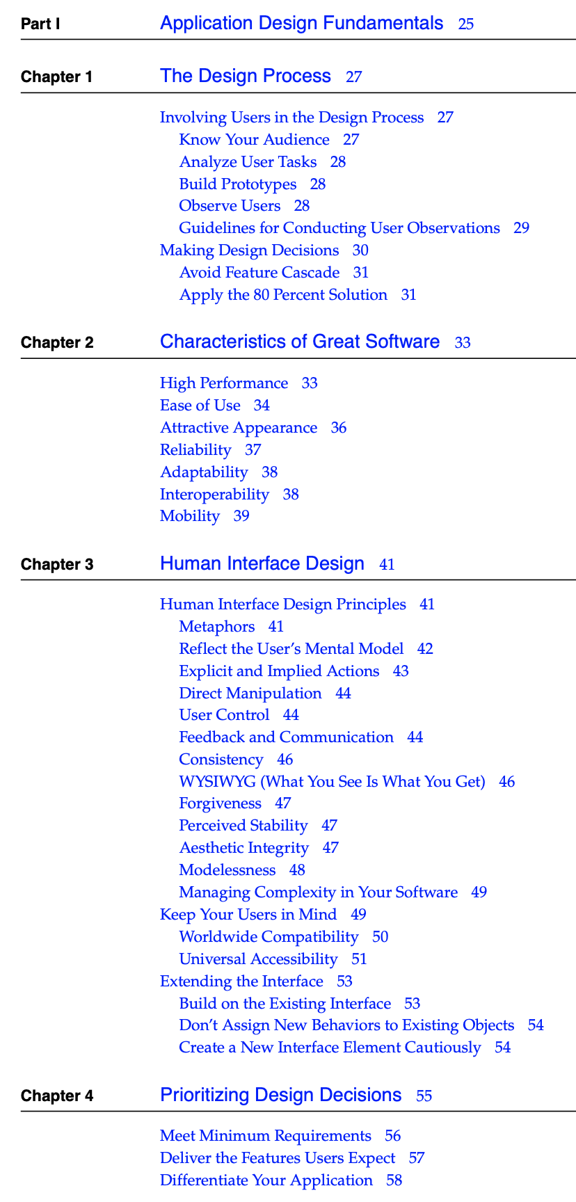
The first section of three, Application Design Fundamentals, has almost nothing to do with Macs specifically. You can just tell from the chapter titles:
- The Design Process
- Characteristics of Great Software
- Human Interface Design
- Prioritizing Design Decisions
Like another favorite, The Design of Everyday Things, it approaches software first and foremost as tools designed for people to use. The specific choices made in app design can be the difference between something that's a joy to use and something that's resented and constantly fought against.
So what exactly did we lose? It's quite simple: by moving software into the cloud and turning them into web-based SaaS offerings, many of the basic affordances that used to be standard have gotten watered down or removed entirely. Here are some examples:
Menus let you cross over empty space and other menu items, instead of strictly enforcing hover rectangles.
You can drag and drop the file icon from a document's titlebar e.g. to upload it, instead of having to go look for it again.
Holding keyboard modifiers like CTRL or ALT is reflected instantly in menus, and used to make power-user features discoverable-yet-unobtrusive.
And here are some more:
- You can browse years of documents, emails, … and instantly draft new ones. Fully off-line, with zero lag.
- You can sort any table by any column, and it will remember prior keys to produce a stable sort for identical values.
- Undo/redo is standard and expected, even when moving entire directories around in the Finder.
- Copy/pasting rich content is normal, and entirely equivalent to dragging and dropping it.
- When you rename or move a file that you're editing, its window instantly reflects the new name and location.
- You can also drag a file into an "open file" dialog, to select it there.
- When downloading a file, the partial download has a progress bar on the icon. It can be double clicked to resume, or even copied to another machine.
It's always amusing to me to watch a power user switch to a Mac late in life, because much of their early complaints stem from not realizing there are far more obvious ways to do what they've trained themselves to do in a cumbersome way.
On almost every platform, PDFs are just awful to use. Whereas out-of-the-box on a Mac, you can annotate them to your heart's content, or drag pages from one PDF to another to recompose it. You can also sign them with a signature read from your webcam, for those of us who still know what pens are for. This is what happens when you tell companies like Adobe to utterly stuff it and just show them how it's supposed to be done, instead of waiting for their approval. The productivity benefits were enormous.

As an aside, if all of this seems quaint or positively boomeresque, here's a tip: forcing yourself to slow down and work with information directly, with your hands, manipulating objects physical or virtual, instead of offloading it all to a cloud… this is not an anti-pattern. Neither is genuine note taking on a piece of paper. You should try it sometime.
At the time, many supposed software experts scoffed at Apple, deriding their products as mere expensive toys differentiated purely by "marketing". But this is the same company that seamlessly transitioned its entire stack from PowerPC, to x86, to x64, and eventually ARM, with most users remaining blissfully unaware this ever took place.
This is what the pinnacle of our craft can actually look like.
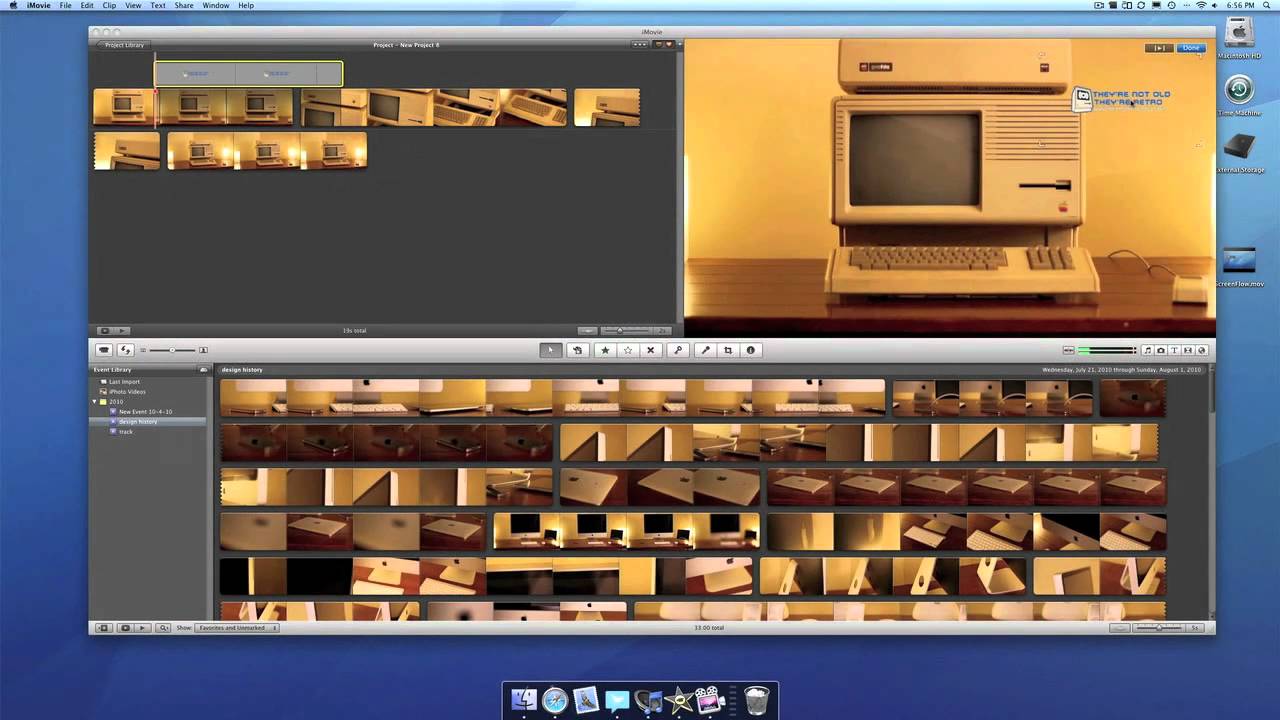
Apple didn't just knock it out of the park when it came to the OS or the overall UI: they also shipped powerful first-party apps like iMovie and Keynote, which made competing offerings look positively shabby. Steve Jobs used them for his own keynotes, arguably the best in the business.
Similarly, what set the iPhone apart was not just its touch interface, but that they actually ported a mature media and document stack to mobile wholesale. At that time, the "mobile web" was a complete and utter joke, and it would take Android years to catch up, whether it was video or music, or basic stuff like calendar invites and contacts.
It has nothing to do with marketing. Indeed, while many companies have since emulated and perfected their own Apple-style pitch, almost no-one manages to get away from that tell-tale "enterprise" feel. They don't know or care how their users actually want to use their products: the people in charge don't have the first clue about the fundamentals of product design. They just like shiny things when they see them.
iMovie - 2010
The Reactive Enterprise
What does any of this have to do with React? Well it's very simple. Mac OS X was the first OS that could actually seriously claim to be reactive.
The standard which virtually everyone emulated back then was Windows. And in Windows, the norm—which mostly remains to this day—is that when you query information, that information is fetched once, and never updated. The user was just supposed to know that in order to see it update, they had to manually refresh it, either by bumping a selection back and forth, or by closing and reopening a dialog.
Windows 95
The same applied to preferences: in Windows land, the established pattern was to present a user with a set of buttons, the triad of Ok, Cancel and Apply. This is awful, and here's why. If you click Ok, you are committing to a choice you haven't yet had the chance to see the implications of. If you click Cancel, you are completely discarding everything you did, without ever trying it out. If you click Apply, it's the same as pressing Ok, just the window stays open. None of the 3 buttons let you interact confidently, or easily try changes one by one, reinforcing the idea that it's the user's fault for being "bad at computers" if it doesn't do what they expect, or they don't know how to back out.
The bold Mac solution was that toggling a preference should take effect immediately. Even if that choice affects the entire desktop, such as changing the UI theme. So if that's not what you wanted, you simply clicked again to undo it right away. Macs were reactive, while Windows was transactional. The main reason it worked this way was because most programmers had no clue how to effectively make their software respond to arbitrary changes, and Microsoft couldn't go a few years without coming up with yet another ill-conceived UI framework.
This divide has mostly remained, with the only notable change being that on mobile devices, both iOS and Android tend to embrace the reactive model. However, given that much of the software used is made partially or wholly out of web views, this is a promise that is often violated and rarely seen as an inviolable constraint. It's just a nice-to-have. Furthermore, while it has become easier to display reactive information, the crucial second half of the equation—interaction—remains mostly neglected, also by design.


I'm going to be cheeky and say if there's anyone who should take the blame for this, it's back-end engineers and the technology choices they continue to make. The very notion of "back-end" is a fallacy: it implies that one can produce a useful, working system, without ever having to talk to end-users.
Just imagine how alien this concept would be to an engineer before the software revolution happened: it'd be like suggesting you build a bridge without ever having to think about where it sits or who drives over it, because that's just "installation" and "surfacing". In civil engineering, catastrophes are rare, and each is a cautionary tale, never to be repeated: the loss of life was often visceral and brutal. But in software, we embraced never learning such lessons.
A specific evil here is the legacy of SQL and the associated practices, which fragments and normalizes data into rigid tables. As a result, the effect of any change is difficult to predict, and virtually impossible to reliably undo or synchronize after the fact.
This is also the fault of "enterprise", in a very direct sense: SQL databases and transactions are mainly designed to model business processes. They evolved to model bureaucratic workflows in actual enterprises, with a clear hierarchy of command, a need to maintain an official set of records, with the ability for auditing and oversight.
However, such classic enterprises were of course still run by people, by individuals. The bulk of the work they did was done offline, producing documents, spreadsheets and other materials through direct interaction and iteration. The bureaucracy was a means to an end, it wasn't the sole activity. The idea of an organization or country run entirely on bureaucracy was the stuff people made satirical movies about.
And yet, many jobs now follow exactly this template. The activity is entirely coordinated and routed through specific SaaS apps, either off-the-shelf or bespoke, which strictly limit the available actions. They only contain watered down mockeries of classic desktop concepts such as files and folders, direct manipulation of data, and parallel off-line workstreams. They have little to no affordances for drafts, iteration or errors. They are mainly designed to appeal to management, not the riff-raff.
The promise of adopting such software is that everything will run more smoothly, and that oversight becomes effortless thanks to a multitude of metrics and paper trails. The reality is that you often replace tasks that ordinary, capable employees could do themselves, with a cumbersome and restrictive process. Information becomes harder to find, mistakes are more difficult to correct, and the normal activity of doing your job is replaced with endless form filling, box-ticking and notification chasing. There is a reason nobody likes JIRA, and this is it.
What's more, by adopting SaaS, companies put themselves at the mercy of someone else's development process. When dealing with an unanticipated scenario, you often simply can't work around it with the tools given, by design. It doesn't matter how smart or self-reliant the employees are: the software forces them to be stupid, and the only solution is to pay the vendor and wait 3 months or more.
For some reason, everyone has agreed that this is the way forward. It's insane.

Oracle Cloud with AI Bullshit
Circling Back
Despite all its embedded architectural wisdom, this is a flaw that React shares: it was never meant to enable user freedom. Indeed, the very concept of Facebook precludes it, arguably the world's biggest lock-in SaaS. The interactions that are allowed there are exactly like any other SaaS: GET and POST to a monolithic back-end, which enforces rigid processes.
As an app developer, if you want to add robust undo/redo, comfy mouse interactions and drag-n-drop, keyboard shortcuts, and all the other goodies that were standard on the desktop, there are no easy architectural shortcuts available today. And if you want to add real-time collaboration, practically a necessity for real apps, all of these concerns spill out, because they cannot be split up neatly into a wholly separate front-end and back-end.
A good example is when people mistakenly equate undo/redo with a discrete, immutable event log. This is fundamentally wrong, because what constitutes an action from user's point of view is entirely different from how a back-end engineer perceives it. For example undo/redo needs to group multiple operations to enable sensible, logical checkpoints… but it also needs to do so on the fly, for actions which are rapid and don't conflict.
If you don't believe me, go type some text in your text editor and see what happens when you press CTRL-Z. It won't erase character by character, but did you ever think about that? Plus, if multiple users collaborate, each needs their own undo/redo stack, which means you need the equivalent of git rebasing and merging. You'd be amazed how many people don't realize this.
If we want to move forward, surely, we should be able to replicate what was normal 20 years ago?


Real-time databases
There are a few promising things happening in the field, but they are so, so rare… like the slow-death-and-rebirth of Firebase into open-source alternatives and lookalikes. But even then, robust real-time collaboration remains a 5-star premium feature.
Similarly, big canvas-based apps like Figma, and scrappy upstarts like TLDraw have to painstakingly reinvent all the wheels, as practically all the relevant knowledge has been lost. And heaven forbid you actually want a decent, GPU-accelerated renderer: you will need to pay a dedicated team of experts to write code nobody else in-house can maintain, because the tooling is awful and also they are scared of math.
What bugs me the most is that the React dev team and friends seem extremely unaware of any of this. The things they are prioritizing simply don't matter in bringing the quality of the resulting software forward, except at the margins. It'll just load the same HTML a bit faster. If you stubbornly refuse to learn what memo(…) is for, it'll render slightly less worse. But the advice they give for event handling, for data fetching, and so on… for advanced use it's simply wrong.
A good example is that GraphQL query subscriptions in Apollo split up the initial GET from the subsequent SUBSCRIBE. This means there is always a chance one or more events were dropped in between the two. Nevertheless, this is how the library is designed, and this is what countless developers are doing today. Well okay then.
Another good example is implementing mouse gestures, because mouse events happen quicker than React can re-render. Making this work right the "proper way" is an exercise in frustration, and eventually you will conclude that everything you've been told about non-HTML-element useRef is a lie: just embrace mutating state here.
In fact, despite being told this will cause bugs, I've never had any issues with it in React 17. This leads me to suspect that what they were really doing was trying to prevent people from writing code that would break in React 18's concurrent mode. If so: dick move, guys. Here's what I propose: if you want to warn people about "subtle bugs", post a concrete proof, or GTFO.
* * *
If you want to build a truly modern, robust, desktop-class web app with React, you will find that you still need to pretty much make apple pie from scratch, by first re-inventing the entire universe. You can try starting with the pre-made stuff, but you will hit a wall, and/or eventually corrupt your users' data. It's simply been my experience, and I've done the React real-time collaboration rodeo with GPU sprinkles on top multiple times now.
Crucially, none of the React alternatives solve this, indeed, they mostly just make it worse by trying to "helpfully" mutate state right away. But here's the annoying truth: you cannot skip learning to reason about well-ordered orchestration. It will just bite you in the ass, guaranteed.
What's really frustrating about all this is how passive and helpless the current generation of web developers seem to be in all this. It's as if they've all been lulled into complacency by convenience. They seem afraid to carve out their own ambitious paths, and lack serious gusto for engineering. If there isn't a "friendly" bot spewing encouraging messages with plenty of 👏 emoji at every turn, they won't engage.
As someone who took a classical engineering education, which included not just a broad scientific and mathematical basis, but crucially also the necessary engineering ethos, this is just alien to me. Call me cynical all you want, but it matches my experience. Coming after the generation that birthed Git and BitTorrent, and which killed IE with Firefox and Konqueror/WebKit, it just seems ridiculous.
Fuck, most zoomers don't even know how to dance. I don't mean that they are bad at dancing, I mean they literally won't try, and just stand around awkwardly.
Just know: nobody else is going to do it for you. So what are you waiting for?


