Rethinking DOM from first principles

Browsers are in a very weird place. While WebAssembly has succeeded, even on the server, the client still feels largely the same as it did 10 years ago.
Enthusiasts will tell you that accessing native web APIs via WASM is a solved problem, with some minimal JS glue.
But the question not asked is why you would want to access the DOM. It's just the only option. So I'd like to explain why it really is time to send the DOM and its assorted APIs off to a farm somewhere, with some ideas on how.
I won't pretend to know everything about browsers. Nobody knows everything anymore, and that's the problem.

The 'Document' Model
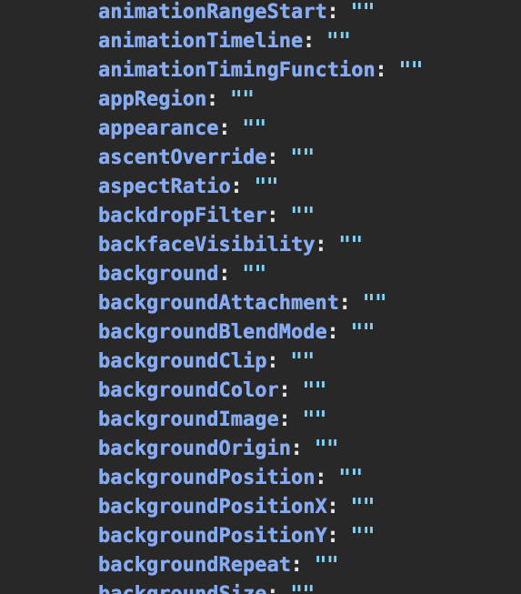
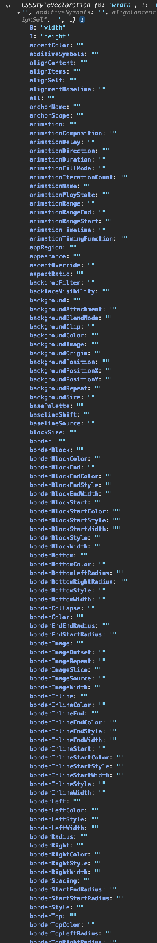
Few know how bad the DOM really is. In Chrome, document.body now has 350+ keys, grouped roughly like this:
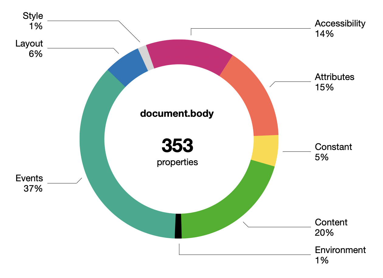
This doesn't include the CSS properties in document.body.style of which there are... 660.
The boundary between properties and methods is very vague. Many are just facades with an invisible setter behind them. Some getters may trigger a just-in-time re-layout. There's ancient legacy stuff, like all the onevent properties nobody uses anymore.
The DOM is not lean and continues to get fatter. Whether you notice this largely depends on whether you are making web pages or web applications.
Most devs now avoid working with the DOM directly, though occasionally some purist will praise pure DOM as being superior to the various JS component/templating frameworks. What little declarative facilities the DOM has, like innerHTML, do not resemble modern UI patterns at all. The DOM has too many ways to do the same thing, none of them nice.
connectedCallback() {
  const
    shadow = this.attachShadow({ mode: 'closed' }),
    template = document.getElementById('hello-world')
      .content.cloneNode(true),
    hwMsg = `Hello ${ this.name }`;

  Array.from(template.querySelectorAll('.hw-text'))
    .forEach(n => n.textContent = hwMsg);

  shadow.append(template);
}
Web Components deserve a mention, being the web-native equivalent of JS component libraries. But they came too late and are unpopular. The API seems clunky, with its Shadow DOM introducing new nesting and scoping layers. Proponents kinda read like apologetics.
The achilles heel is the DOM's SGML/XML heritage, making everything stringly typed. React-likes do not have this problem, their syntax only looks like XML. Devs have learned not to keep state in the document, because it's inadequate for it.

For HTML itself, there isn't much to critique because nothing has changed in 10-15 years. Only ARIA (accessibility) is notable, and only because this was what Semantic HTML was supposed to do and didn't.
Semantic HTML never quite reached its goal. Despite dating from around 2011, there is e.g. no <thread> or <comment> tag, when those were well-established idioms. Instead, an article inside an article is probably a comment. The guidelines are... weird.
There's this feeling that HTML always had paper-envy, and couldn't quite embrace or fully define its hypertext nature, and did not trust its users to follow clear rules.
Stewardship of HTML has since firmly passed to WHATWG, really the browser vendors, who have not been able to define anything more concrete as a vision, and have instead just added epicycles at the margins.
Along the way even CSS has grown expressions, because every templating language wants to become a programming language.
Editability of HTML remains a sad footnote. While technically supported via contentEditable, actually wrangling this feature into something usable for applications is a dark art. I'm sure the Google Docs and Notion people have horror stories.
Nobody really believes in the old gods of progressive enhancement and separating markup from style anymore, not if they make apps.
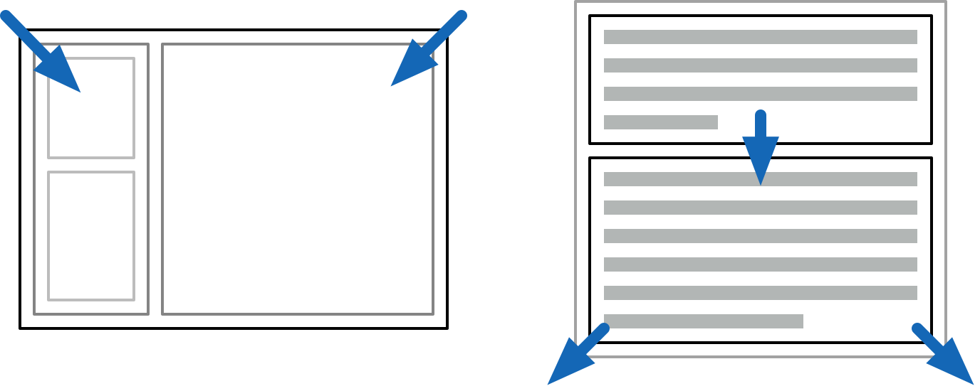
Most of the applications you see nowadays will kitbash HTML/CSS/SVG into a pretty enough shape. But this comes with immense overhead, and is looking more and more like the opposite of a decent UI toolkit.
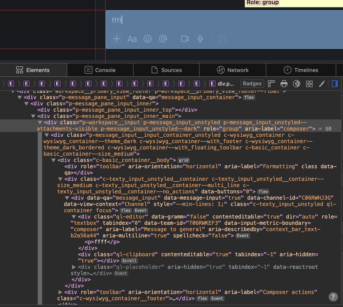
The Slack input box
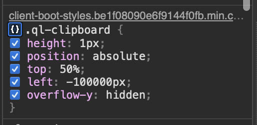
Off-screen clipboard hacks
Lists and tables must be virtualized by hand, taking over for layout, resizing, dragging, and so on. Making a chat window's scrollbar stick to the bottom is somebody's TODO, every single time. And the more you virtualize, the more you have to reinvent find-in-page, right-click menus, etc.
The web blurred the distinction between UI and fluid content, which was novel at the time. But it makes less and less sense, because the UI part is a decade obsolete, and the content has largely homogenized.

CSS is inside-out
CSS doesn't have a stellar reputation either, but few can put their finger on exactly why.
Where most people go wrong is to start with the wrong mental model, approaching it like a constraint solver. This is easy to show with e.g.:
<div>
  <div style="height: 50%">...</div>
  <div style="height: 50%">...</div>
</div>
<div>
<div style="height: 100%">...</div>
<div style="height: 100%">...</div>
</div>The first might seem reasonable: divide the parent into two halves vertically. But what about the second?
Viewed as a set of constraints, it's contradictory, because the parent div is twice as tall as... itself. What will happen instead in both cases is the height is ignored. The parent height is unknown and CSS doesn't backtrack or iterate here. It just shrink-wraps the contents.
If you set e.g. height: 300px on the parent, then it works, but the latter case will still just spill out.
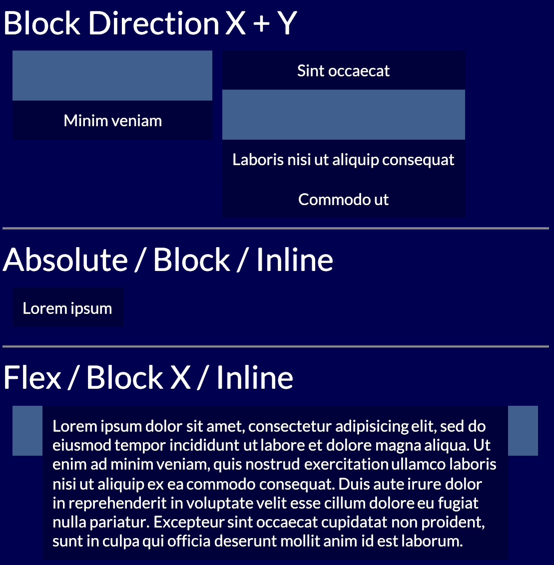
Outside-in and inside-out layout modes
Instead, your mental model of CSS should be applying two passes of constraints, first going outside-in, and then inside-out.
When you make an application frame, this is outside-in: the available space is divided, and the content inside does not affect sizing of panels.
When paragraphs stack on a page, this is inside-out: the text stretches out its containing parent. This is what HTML wants to do naturally.
By being structured this way, CSS layouts are computationally pretty simple. You can propagate the parent constraints down to the children, and then gather up the children's sizes in the other direction. This is attractive and allows webpages to scale well in terms of elements and text content.
CSS is always inside-out by default, reflecting its document-oriented nature. The outside-in is not obvious, because it's up to you to pass all the constraints down, starting with body { height: 100%; }. This is why they always say vertical alignment in CSS is hard.

Use flex grow and shrink for spill-free auto-layouts with completely reasonable gaps
The scenario above is better handled with a CSS3 flex box (display: flex), which provides explicit control over how space is divided.
Unfortunately flexing muddles the simple CSS model. To auto-flex, the layout algorithm must measure the "natural size" of every child. This means laying it out twice: first speculatively, as if floating in aether, and then again after growing or shrinking to fit:
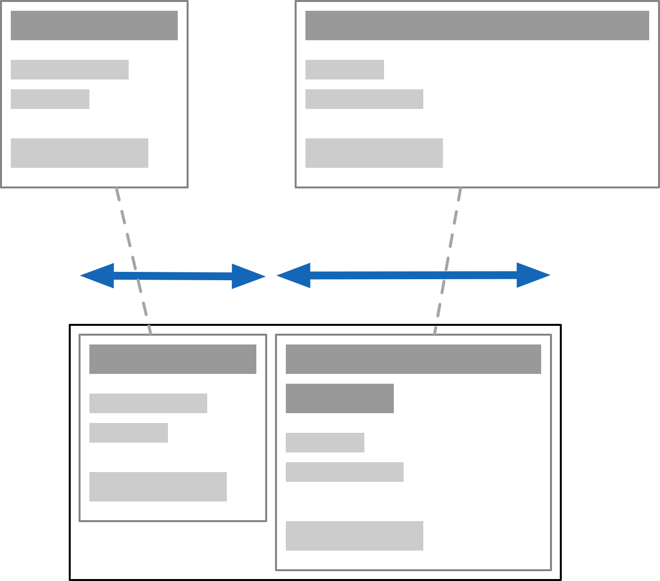
This sounds reasonable but can come with hidden surprises, because it's recursive. Doing speculative layout of a parent often requires full layout of unsized children. e.g. to know how text will wrap. If you nest it right, it could in theory cause an exponential blow up, though I've never heard of it being an issue.
Instead you will only discover this when someone drops some large content in somewhere, and suddenly everything gets stretched out of whack. It's the opposite of the problem on the mug.
To avoid the recursive dependency, you need to isolate the children's contents from the outside, thus making speculative layout trivial. This can be done with contain: size, or by manually setting the flex-basis size.
CSS has gained a few constructs like contain or will-change, which work directly with the layout system, and drop the pretense of one big happy layout. It reveals some of the layer-oriented nature underneath, and is a substitute for e.g. using position: absolute wrappers to do the same.
What these do is strip off some of the semantics, and break the flow of DOM-wide constraints. These are overly broad by default and too document-oriented for the simpler cases.
This is really a metaphor for all DOM APIs.
The Good Parts?
That said, flex box is pretty decent if you understand these caveats. Building layouts out of nested rows and columns with gaps is intuitive, and adapts well to varying sizes. There is a "CSS: The Good Parts" here, which you can make ergonomic with sufficient love. CSS grids also work similarly, they're just very painfully... CSSy in their syntax.
But if you designed CSS layout from scratch, you wouldn't do it this way. You wouldn't have a subtractive API, with additional extra containment barrier hints. You would instead break the behavior down into its component facets, and use them à la carte. Outside-in and inside-out would both be legible as different kinds of containers and placement models.
The inline-block and inline-flex display models illustrate this: it's a block or flex on the inside, but an inline element on the outside. These are two (mostly) orthogonal aspects of a box in a box model.
Text and font styles are in fact the odd ones out, in hypertext. Properties like font size inherit from parent to child, so that formatting tags like <b> can work. But most of those 660 CSS properties do not do that. Setting a border on an element does not apply the same border to all its children recursively, that would be silly.
It shows that CSS is at least two different things mashed together: a system for styling rich text based on inheritance... and a layout system for block and inline elements, nested recursively but without inheritance, only containment. They use the same syntax and APIs, but don't really cascade the same way. Combining this under one style-umbrella was a mistake.
Worth pointing out: early ideas of relative em scaling have largely become irrelevant. We now think of logical vs device pixels instead, which is a far more sane solution, and closer to what users actually expect.

SVG is natively integrated as well. Having SVGs in the DOM instead of just as <img> tags is useful to dynamically generate shapes and adjust icon styles.
But while SVG is powerful, it's neither a subset nor superset of CSS. Even when it overlaps, there are subtle differences, like the affine transform. It has its own warts, like serializing all coordinates to strings.
CSS has also gained the ability to round corners, draw gradients, and apply arbitrary clipping masks: it clearly has SVG-envy, but falls very short. SVG can e.g. do polygonal hit-testing for mouse events, which CSS cannot, and SVG has its own set of graphical layer effects.
Whether you use HTML/CSS or SVG to render any particular element is based on specific annoying trade-offs, even if they're all scalable vectors on the back-end.
In either case, there are also some roadblocks. I'll just mention three:
text-ellipsiscan only be used to truncate unwrapped text, not entire paragraphs. Detecting truncated text is even harder, as is just measuring text: the APIs are inadequate. Everyone just counts letters instead.position: stickylets elements stay in place while scrolling with zero jank. While tailor-made for this purpose, it's subtly broken. Having elements remain unconditionally sticky requires an absurd nesting hack, when it should be trivial.- The
z-indexproperty determines layering by absolute index. This inevitably leads to az-index-war.csswhere everyone is putting in a new number +1 or -1 to make things layer correctly. There is no concept of relative Z positioning.
For each of these features, we got stuck with v1 of whatever they could get working, instead of providing the right primitives.
Getting this right isn't easy, it's the hard part of API design. You can only iterate on it, by building real stuff with it before finalizing it, and looking for the holes.
Oil on Canvas
So, DOM is bad, CSS is single-digit X% good, and SVG is ugly but necessary... and nobody is in a position to fix it?
Well no. The diagnosis is that the middle layers don't suit anyone particularly well anymore. Just an HTML6 that finally removes things could be a good start.
But most of what needs to happen is to liberate the functionality that is there already. This can be done in good or bad ways. Ideally you design your system so the "escape hatch" for custom use is the same API you built the user-space stuff with. That's what dogfooding is, and also how you get good kernels.
A recent proposal here is HTML in Canvas, to draw HTML content into a <canvas>, with full control over the visual output. It's not very good.
While it might seem useful, the only reason the API has the shape that it does is because it's shoehorned into the DOM: elements must be descendants of <canvas> to fully participate in layout and styling, and to make accessibility work. There are also "technical concerns" with using it off-screen.
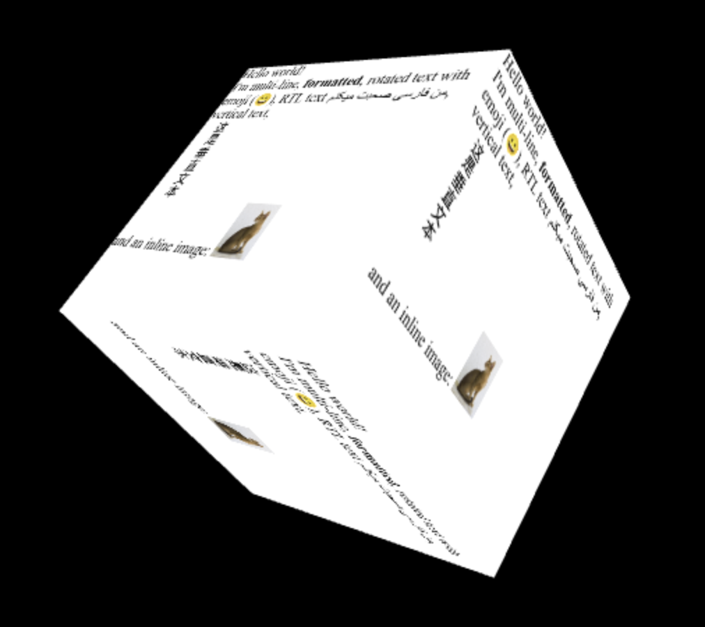
One example is this spinny cube:
 </a>
</a>
To make it interactive, you attach hit-testing rectangles and respond to paint events. This is a new kind of hit-testing API. But it only works in 2D... so it seems 3D-use is only cosmetic? I have many questions.
Again, if you designed it from scratch, you wouldn't do it this way! In particular, it's absurd that you'd have to take over all interaction responsibilities for an element and its descendants just to be able to customize how it looks i.e. renders. Especially in a browser that has projective CSS 3D transforms.
The use cases not covered by that, e.g. curved re-projection, will also need more complicated hit-testing than rectangles. Did they think this through? What happens when you put a dropdown in there?
To me it seems like they couldn't really figure out how to unify CSS and SVG filters, or how to add shaders to CSS. Passing it thru canvas is the only viable option left. "At least it's programmable." Is it really? Screenshotting DOM content is 1 good use-case, but not what this is sold as at all.
The whole reason to do "complex UIs on canvas" is to do all the things the DOM doesn't do, like virtualizing content, just-in-time layout and styling, visual effects, custom gestures and hit-testing, and so on. It's all nuts and bolts stuff. Having to pre-stage all the DOM content you want to draw sounds... very counterproductive.
From a reactivity point-of-view it's also a bad idea to route this stuff back through the same document tree, because it sets up potential cycles with observers. A canvas that's rendering DOM content isn't really a document element anymore, it's doing something else entirely.
Canvas-based spreadsheet that skips the DOM entirely
The actual achilles heel of canvas is that you don't have any real access to system fonts, text layout APIs, or UI utilities. It's quite absurd how basic it is. You have to implement everything from scratch, including Unicode word splitting, just to get wrapped text.
The proposal is "just use the DOM as a black box for content." But we already know that you can't do anything except more CSS/SVG kitbashing this way. text-ellipsis and friends will still be broken, and you will still need to implement UIs circa 1990 from scratch to fix it.
It's all-or-nothing when you actually want something right in the middle. That's why the lower level needs to be opened up.
Where To Go From Here
The goals of "HTML in Canvas" do strike a chord, with chunks of HTML used as free-floating fragments, a notion that has always existed under the hood. It's a composite value type you can handle. But it should not drag 20 years of useless baggage along, while not enabling anything truly novel.
The kitbashing of the web has also resulted in enormous stagnation, and a loss of general UI finesse. When UI behaviors have to be mined out of divs, it limits the kinds of solutions you can even consider. Fixing this within DOM/HTML seems unwise, because there's just too much mess inside. Instead, new surfaces should be opened up outside of it.
WebGPU-based box model
My schtick here has become to point awkwardly at Use.GPU's HTML-like renderer, which does a full X/Y flex model in a fraction of the complexity or code. I don't mean my stuff is super great, no, it's pretty bare-bones and kinda niche... and yet definitely nicer. Vertical centering is easy. Positioning makes sense.
There is no semantic HTML or CSS cascade, just first-class layout. You don't need 61 different accessors for border* either. You can just attach shaders to divs. Like, that's what people wanted right? Here's a blueprint, it's mostly just SDFs.
Font and markup concerns only appear at the leaves of the tree, where the text sits. It's striking how you can do like 90% of what the DOM does here, without the tangle of HTML/CSS/SVG, if you just reinvent that wheel. Done by 1 guy. And yes, I know about the second 90% too.
The classic data model here is of a view tree and a render tree. What should the view tree actually look like? And what can it be lowered into? What is it being lowered into right now, by a giant pile of legacy crud?


Alt-browser projects like Servo or Ladybird are in a position to make good proposals here. They have the freshest implementations, and are targeting the most essential features first. The big browser vendors could also do it, but well, taste matters. Good big systems grow from good small ones, not bad big ones. Maybe if Mozilla hadn't imploded... but alas.
Platform-native UI toolkits are still playing catch up with declarative and reactive UI, so that's that. Native Electron-alternatives like Tauri could be helpful, but they don't treat origin isolation as a design constraint, which makes security teams antsy.
There's a feasible carrot to dangle for them though, namely in the form of better process isolation. Because of CPU exploits like Spectre, multi-threading via SharedArrayBuffer and Web Workers is kinda dead on arrival anyway, and that affects all WASM. The details are boring but right now it's an impossible sell when websites have to have things like OAuth and Zendesk integrated into them.
Reinventing the DOM to ditch all legacy baggage could coincide with redesigning it for a more multi-threaded, multi-origin, and async web. The browser engines are already multi-process... what did they learn? A lot has happened since Netscape, with advances in structured concurrency, ownership semantics, FP effects... all could come in handy here.
* * *
Step 1 should just be a data model that doesn't have 350+ properties per node tho.
Don't be under the mistaken impression that this isn't entirely fixable.