New Design for Acko.net
If you're not reading this through an aggregator, you will have already noticed: I've redesigned my website.
The last theme lasted about 2.5 years, so it was time for something new and fresh.
Now, I don't know about you, but honestly I'm a bit tired of all the pastelly rounded corners and soft shadows that are all the rage today. Sure, it looks nice and neutral, but I'd prefer something with a little more oomph. So, after a day of fun with vectors tools, a highly saturated color palette and some browser-fighting, my geometric theme (uncreatively called Acko8) is completed.
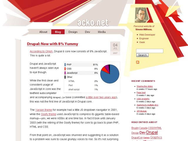
The result is, as you'd expect, tableless and semantic XHTML/CSS. The theme should work from 800x600 up without scrolling (though at higher resolutions, more eye candy sticks out on the sides). Whether it is aesthetically pleasing depends of course on your own tastes. But I sure love the way it turned out!
What's cool is that I specifically crafted the underlying CSS skeleton to allow images to 'break out' of the text flow. The previous design tried this as well, but had several nasty issues with it. The effect is quite nice.
Aside from the looks I already reorganised the site a bit. The front door page was removed in favor of a more direct approach. I put my side projects a bit more in the spotlight as well. Finally, I emphasised the personal aspect, with a clear explanation of the site's purpose in the upper-right corner on every page.
Comments welcome!